
The End of the Trend and Four Other Takeaways From High Point Market
Though it may seem counterintuitive to their nature, trend forecasters at the recent High Point Market agreed that the era of major shifts in home fashion is over, at least for now.
“What’s happening in trends is as opposed to a revolution, we’re not seeing any big sweeping changes,” said Patti Carpenter, global brand ambassador at Maison & Objet. “On the heels of the pandemic we certainly saw some things that were more big shifts coming down, but we’re seeing things settle down, and you’re seeing a lot more evolution.”
More from WWD
Brigette Romanek Toasts New Book, With Jessica Alba, Kelly Rowland, Lupita Nyong'o
Black Friday Mattress Sales: The Best Early Deals and What to Expect This Year
Rather than seismic shifts — think the gray takeover that hit furnishings, finishes and decor a decade ago — today’s trends are more subtle and extend well beyond a season or two.
“The world is converging on the same macro trends,” said Sue Wadden, director of color marketing at Sherwin-Williams. “There’s nothing brand-new — we’re all talking about nature, we’ve all got a brights palette — and we’re telling all the same redundant stories.”
That said, walking the showrooms of the semi-annual furnishings show in High Point, N.C., several themes seemed to dominate the conversation. They include:
Science shaping design
Prior to the kickoff of High Point Market, a group of scientists, architects and interior designers gathered to discuss the growing role of science in home design at the inaugural Design, Art + Science Symposium. Exploring topics such as biophilic design (the practice of incorporating nature in the home) and neuroaesthetics (harnessing the way design impacts the brain to create more inclusive spaces), the symposium highlighted the growing influence of scientific approaches in interior design.
“We want to cross-pollinate information from different fields together, promoting interdisciplinary thinking that marries science, technology and the arts together to create better experiences within the field of design,” said Suchi Reddy, founder, Reddymade Architecture and Design.
Home as a wellness haven
The pandemic-inspired desire to cultivate a home that feels like a haven for wellness and health continues to dominate the design world, influencing everything from colors to materials and production practices. In fact, starting in 2024, interior designers will be required to obtain a certain number of health, safety and welfare (HSW) continuing education credits each year.
“These are foundational practices,” Wadden said. “For instance, it’s not just about color — it’s about color in application and how color can impact interiors in both residential and commercial design. Things like ensuring there’s enough contrast in light and color in the kitchen so that tasks being done on a countertop happen in a way that humans can see them in the best capacity.”
Green and blue domination
Perhaps due to their connection to nature, blues and greens continue to dominate the home color palette. Wadden said that while green has dominated the first part of this decade, blue will come on strong during the latter half. But that doesn’t mean green is going away anytime soon.
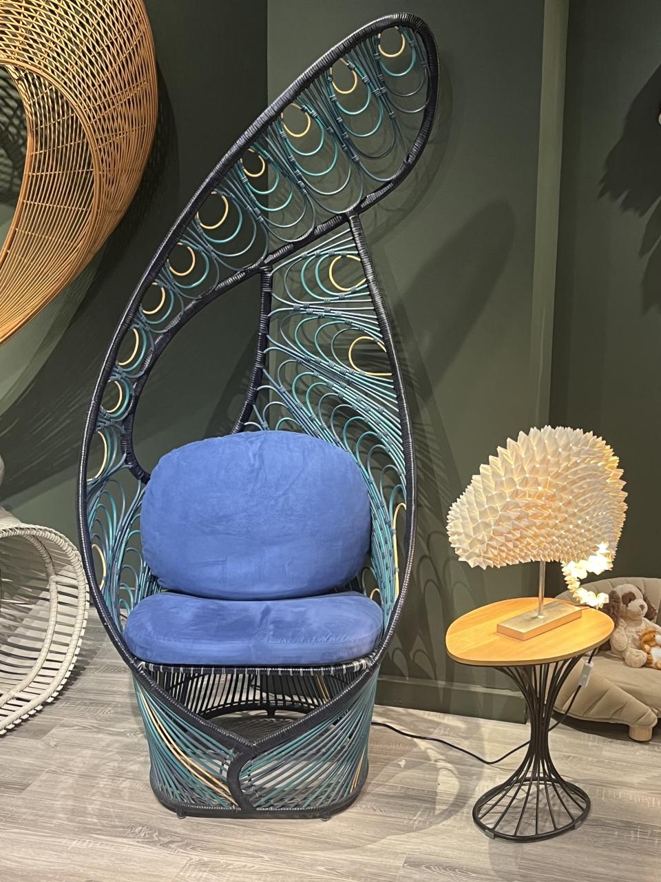
Blue and green galore in this chair from Kenneth Cobonpue.
“There’s definitely a physiological response, particularly with green, because of its strong association to biophilic design — the idea of bringing in nature is super important,” she said. “And it leads to human satisfaction in a space — there is such a positive reaction to most greens, so it’s a way to bring a sanctuary color into the home.”
Carpenter said blues have grown richer at European markets such as Maison & Objet, with shades such as cobalt, Yves Klein blue, turquoise, watery blues and teals dominating.
“The blues are a big area in terms of color — we call it the blue wave,” Carpenter said. “Turquoise has gotten bluer, teals are going more blue — you’re seeing this blue infusion.”
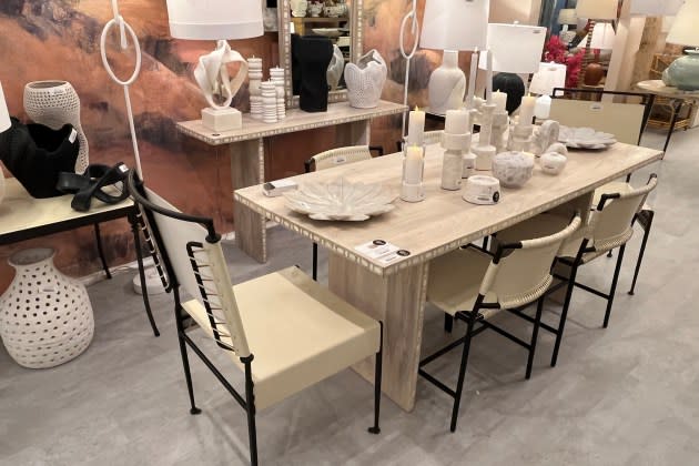
Nuanced neutrals
Neutrals get more complex, with casts of gray, blue, green and other hues adding a richness and versatility. Carpenter pointed to a shade she calls “frosted moss,” which is a gray-green color she sees as a neutral.
“We’ve been talking about these nuanced neutrals, this sense of a touch of color onto a neutral base,” she said. “It’s almost like you took a can of paint and dropped another color in there to give that hue a tint, so we’re seeing these nuanced colors that play with light and texture — in different lighting or on different textures they may look a little gray or green.”
That also carries over to whites, which Wadden said have supplanted neutrals, particularly when they have a tint of another color. She said that for the first time, Sherwin-Williams hasn’t included a neutral palette in its color forecast, which reflects this more nuanced take.
“We’re focusing on core groupings with neutrals sprinkled in,” she said. “Which is a very interesting conversation for North America since we’re so reliant on neutrals for design. It will be interesting to see how this color cycle is evolving and becoming a little more chromatic.”
Metal materials
Drawing on the rise of sustainability and an increased interest in craftsmanship, metals have grown in importance for the home.
“We continue to see a lot going on in metal,” Carpenter said. “People are wanting to work with materials that don’t require taking living things from the earth, so we’re seeing a lot of interesting play in metal from the modern to the traditional.”
Carpenter said furnishings and decor makers have taken creative approaches to using metal, incorporating unexpected techniques such as laser cutting, basket weaving and lattice work.
In terms of metal tones, Carpenter said something she calls “bronzino,” which falls somewhere between bronze and brass, has grown in popularity. But above all, copper seems to be the metal du jour for the home over the coming seasons.
“We started to see all these different ways that copper tones are coming through,” she said. “A lot of it is in metal, but in other materials, too.”

