
YouTube TV just rolled out a redesign to address complaints — here's what's new
Two months ago YouTube TV tried to shake things up, and wound up sending some users to the internet to complain. Some said YouTube TV's redesigned library page was 'disastrous,' and one even called for people to be fired. The internet is great for restrained replies.
Specifically, the new library look raised ire for going a bit too far by offering too many options, and straying from the previous and simple look. Fortunately, YouTube TV acknowledged the response in May, saying it "heard your feedback about Library issues and are working on fixes to address the relevancy of Catch Up on your Favorites, incorrect Watch badging, and ordering of Recently Recorded entries."
Over the weekend, a new look for YouTube TV rolled out, as Cord Cutters News shared. The most important change in the redesign applies to the library (i.e. DVR), and reverts things to the way they were when people weren't complaining.
YouTube TV's library sorting options are back on the left side of the page, and the first option ("New in your library") makes it easier to open your most recent recordings, which are likely the ones you're often interested in finding. YouTube TV may also have increased icon size on the home screen.
Here's the original graphic from YouTube TV that showed the redesign plans from back in January. The service has now gone back to the "Before" look, away from the "After" layout.
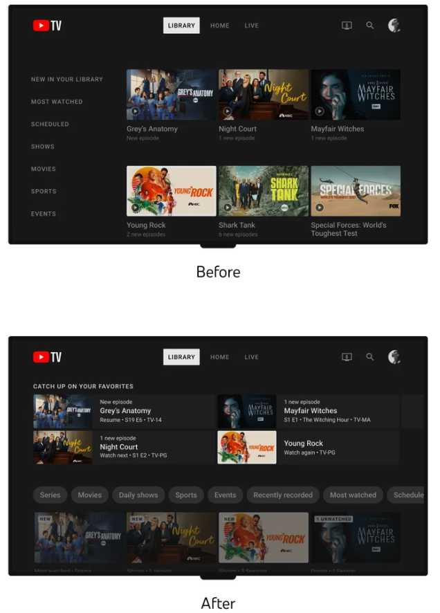
Originally, YouTube TV's Esther Ahn (Head of Design for YouTube TV and Primetime Channels) blogged that this change would "help you manage your content with improved content filtering and better organizational tools to make your library feel less cluttered. Users should begin seeing this redesign over the next few months." That was back on January 18th.
This new look should be available on YouTube TV's apps across all of the best streaming devices. If you don't see it immediately, you'll probably just need to wait. YouTube TV didn't promote this update, so it could easily be something rolling out in waves.
Outlook: The angry mob seems to be appeased
Over on the YouTube TV subreddit, user FrankPoncherello1967 writes that the redesigned interface "is much better now. The A to Z is now standard and the Library options are vertical and on the left side of the screen. Next, please fix the Guide issues." Users beadnej, biggersc08, Psyren1317 echoed that sentiments.
The reaction is not universal, though, as users pawdog and Knighthokie23 liked the change (or at least thought it was getting better).
Either way, it's good to see YouTube TV acknowledging a backlash to a redesign online. Many services and apps just press ahead with their new looks thinking they're right. YouTube TV doing something different helps it keep its high ranking in our list of the best cable TV alternatives.

