
Top 5 Paint Colors for Fall 2023
Time to plan your next paint project!
Farrow & Ball
Fall is almost here and if your home needs a refresh, there’s no better way to do it than with a brand new coat of paint. The hard part is choosing the color. If you want your home to feel updated and fresh, consider trying one of the fall's top paint trends. Whether you need to paint a living room, bedroom, hallway, or even a powder room—brush on one of these paint colors interior designers predict will be popular for fall 2023.

Farrow & Ball
Related: These Are All the Predictions for 2023 Color of the Year (So Far)

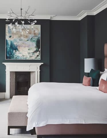
Benjamin Moore
Hasbrouck Brown by Benjamin MooreBrown Hues
Interior designer Audrey Scheck sees dark colors such as brown hues being on trend this fall. “Designers are going bold with wall-to-wall color that makes a statement, and dark paint is a simple way to evoke moodiness," she explains. "As we move into autumn, we predict that shades of brown will continue to take over. From chocolate brown to lighter, more mushroom-colored tones, brown is definitely having a moment. Some of our current favorites are Hasbrouck Brown, Plymouth Rock, and Smokey Taupe by Benjamin Moore.”
Sherwin-Williams
Expressive Plum by Sherwin-WilliamsHints of Lavender
Purple clothing and accessories were big in recent months, and we will see this trend move into the home space as well. “Purples are also having a moment, and we're loving seeing everything from light lavender tones to deep, rich eggplant colors popping up in the design world,” says Scheck. “Mauve Desert by Benjamin Moore is my current obsession. It's a beautiful light purple with lots of gray in it, which makes it feel really mature. We're using Mauve Desert in a project paired with Expressive Plum by Sherwin-Williams, and it's been so much fun designing around the resurgence of purple.”
If you like purple but it doesn't really work with your current design scheme, consider this color for a sophisticated, yet whimsical powder room, a fun home office, or a sweet child's room.
Farrow & Ball
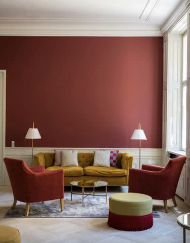
Eating Room Red by Farrow & BallBold Shades of Red
Interior designer Tamara Honey tells me she is a big fan of Farrow & Ball’s Eating Room Red. “House of Honey loves to be daring, and using bold courageous color is the perfect start to creating soulful spaces that invite and connect. The deepened, rich pigmented finish of Eating Room Red adds a pop of color while creating a sense of joy and celebration in the kitchen of one of our boldly appointed and elegant Montecito projects.”
But Honey isn’t the only designer touting this color, interior designer Bethanie Jean tells me. “Anywhere you want to create a sultry vibe, this color is autumn in a can! It’s deeper than a terra-cotta red and not as brazen as a wine red. It would certainly work well in a dining room for intimate holiday gatherings, as well as bedrooms, dens, and bathrooms.”
Jean also suggests using Sherwin-Williams Foxy SW 6333 as a more budget-friendly choice.
Sherwin-Williams
Glamour by Sherwin-WilliamsSophisticated Pinks
The Barbie movie was a major blockbuster hit and the Barbiecore look is going full force this summer. But Barbiecore can be a bit too much for some homes, so Jean thinks Farrow & Ball’s Sulking Room Pink can be a tamer way to go pink. “This beigey-blush feels sexy, mature, and is very easy on the eyes in comparison to many other pink contenders," Jean explains.
The designer also tells me that Sherwin-Williams' Glamour SW 6031 will also be big in the upcoming season.
Farrow & Ball
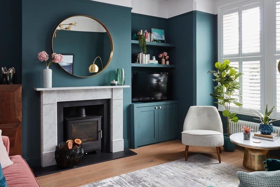
Inchyra Blue by Farrow & BallBlue and Green Jewel Tones
Lastly, Jean predicts Farrow & Ball’s Inchyra Blue will trend during the autumn months. “This color has whimsical properties to the eye. It has found a way to lean both green and blue. It also acts as a more interesting form of gray in darker spaces. Consider it the mood ring of wall colors, and it is quite moody!"
For more Real Simple news, make sure to sign up for our newsletter!
Read the original article on Real Simple.

