

23 living room colour combinations to consider
Choosing the right colour for your living room can carry a bit more weight than other design decisions because it's a room that is so well used, and often so multifunctional. Where the colour palette in your bedroom can largely be dictated by soothing shades, or a small bathroom can be a spot for experimentation, a living room needs to support moments of relaxation, work and entertaining for the whole family.
Colour in your living room doesn't necessarily have to be wall-to-wall. You can use clever paint techniques to colour skirting boards and window frames, focus your colour on a single feature, or do away with colour on your walls altogether to just use modest accents. Nor does it mean bright tropical shades, although there is a fabulous example on our list. You could instead go totally neutral with a crowd-pleasing 'greige,' a white-on-white or moody all black.
Here, we look at 23 inspiring living rooms with plenty of ideas to steal.
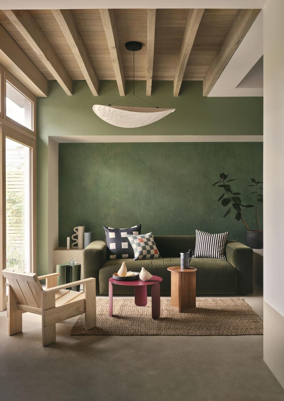
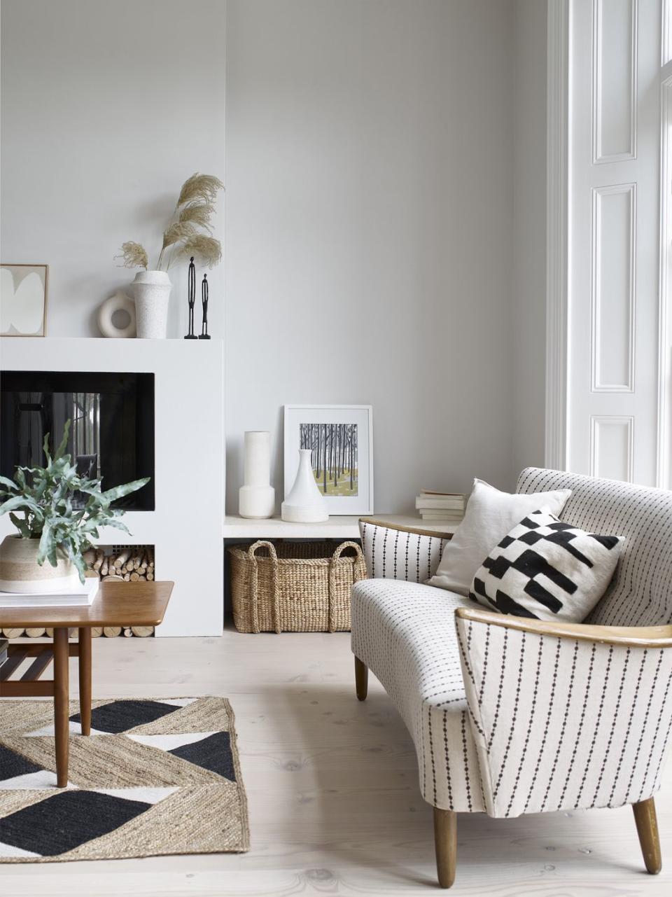
New neutrals
The evolution of Scandi-inspired design, from cool and minimalist to cosy and cocooning, informs an array of new, warmer neutrals. One of the joys of this colour palette is its susceptibility to natural light – uplifting pink and green undertones can be revealed over the course of the day, only to modulate into warming peaches and yellows at night. Perfect for a living room that gets used at all hours.
Pictured: Walls painted in White 05 at Lick
Read more: How to use warm neutrals in every room in the home
Pistachio
A sunny corner like this will always benefit from a paint colour with yellow undertones – this delicate pistachio shade is a great example. This is also a nice one to reference for living rooms with an all-over pastel colour scheme – while the modest accents of black provide some contrast, there is a real embrace of pale and delicate tones.
Pictured: House Beautiful Ada Chenille Chaise Sofa at DFS
Old/new blue
Blue has some regency connotations that lend themselves to decorating dramatic spaces with an old-meets-new quality. The brass and mustard yellows are a brilliant partner, and a third match here would be a postbox red. Note that this living room benefits from a lot of natural light, which helps to lift the deep indigo blue on the walls.
Pictured: Walls painted in Stone Blue at Farrow & Ball
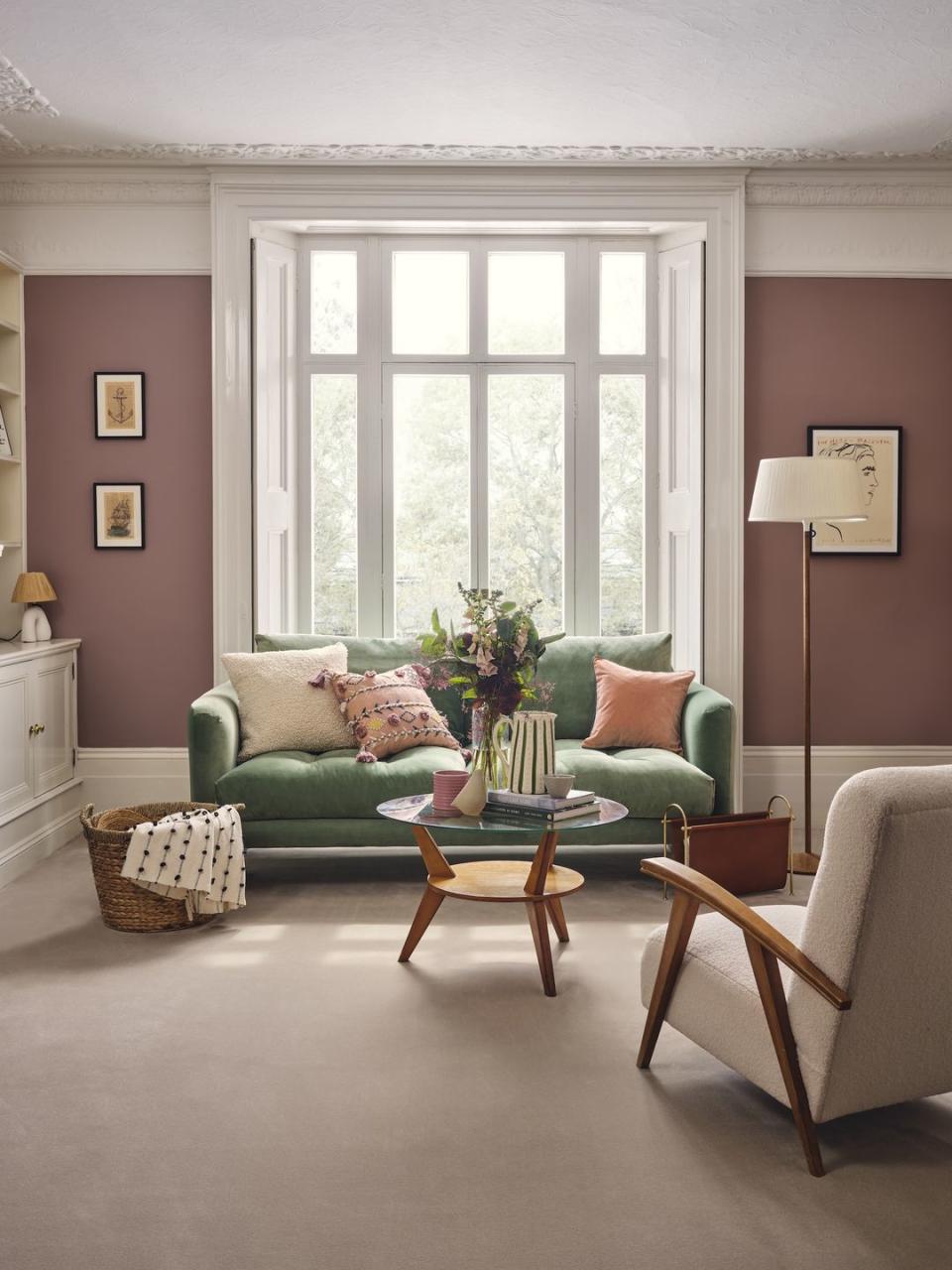
Mauve and green
Colours found on opposite sides of the colour wheel, like red and green, are known as 'complementary' colours because they have a high contrast between them. A bright red and green combination would be quite saturated and vibrant, so this mauve and sage mix is a nice muted variation on the theme.
Pictured: Good Housekeeping Chartwell carpet at Carpetright
Read more: 21 colour combinations that just work
Botanical green
There's an abundance of botanical references in this light and airy living room. The crisp apple green makes the perfect companion to accents of fuchsia and the pale browns of jute and rattan. This is a great example of how to introduce colour without splashing it across your walls.
Pictured: Banoffee Sofa and Marmo Coffee Table, both at Loaf
Read more: Green living room ideas: 21 ways to decorate with green

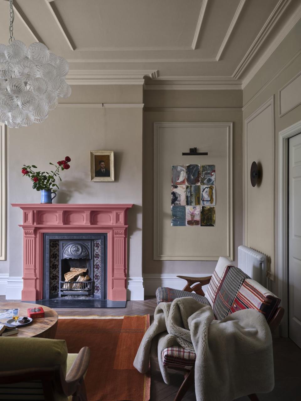
Mushroom
This earthy mushroom colour is similar to a greige (more on that below) but with a good deal more warmth. What is so wonderful here is the shock of putty pink on the fireplace which is an unexpected but totally welcome addition. This sort of colour will respond beautifully to natural light, so one for the south-facing living rooms that are regularly flooded with sunlight.
Pictured: Walls painted in Jitney at Farrow & Ball
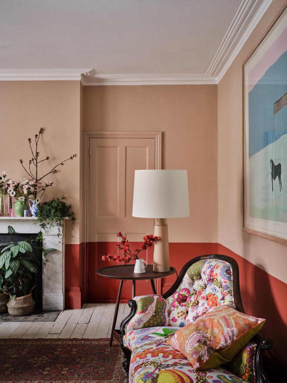
Two-tone
Usually considered a clashing pair, pink and red sit close to one another on the colour wheel, and so can work harmoniously in a living room when shades are chosen correctly. A vivid pink and bright red combination can appear highly saturated and overwhelming, but softening your pink tones lets a fiery red stand out. We love the paint effect that creates a clever faux wall panel.
Pictured: Templeton Pink at Farrow & Ball
Read more: Farrow & Ball colours in real homes
Greige
The grey-beige 'greige' is often favoured over a true grey for its capacity to warm up a design scheme. Greige is really the best of both worlds, combining the cooler tones of grey with the warming nature of beige. As you can see here, it creates a really serene spot. The green of the tree is an important styling element here, as it prevents the living room from looking washed out.
Pictured: Cookham Reclaimed Coffee Table, and all accessories at Layered Lounge
Read more: 17 ways with greige - how to master the grey/beige neutral
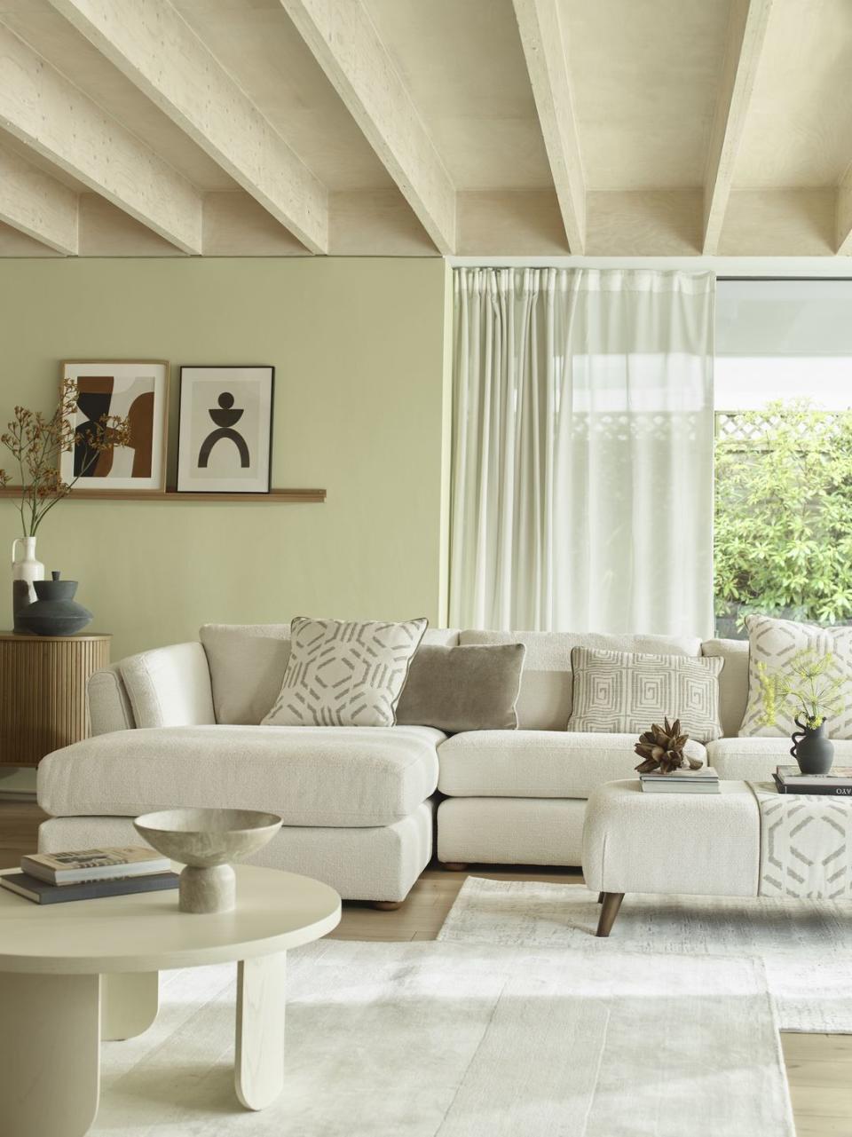
Green
The versatility of green makes it a bit of a gift in interior design, but doesn't make it easier to narrow down your choice of colour combination. If you're lucky enough to have ample wood tones in your home like this fabulous living room, it makes for an instant pairing. Note the textured finish on the walls that is picked up so beautifully in a flood of natural light.
Pictured: Tense pendant light at Holloways of Ludlow, HAY Crate armchair at TwentyTwentyOne, Sofa at Aria
Blush pink
Pink has been slowly creeping back into interiors – Dulux's colour of the year is a soft blush – hastened only by the popularity of the Barbie movie. But the real-world take is far more moderate, favouring a whisper soft rose and natural clay. In terms of application, pink is a natural partner to white painted woods and organic textures like linen or stone, which can moderate some of its sweetness.
Pictured: House Beautiful Truffle Shutters Hillarys
Read more: 8 window dressing ideas
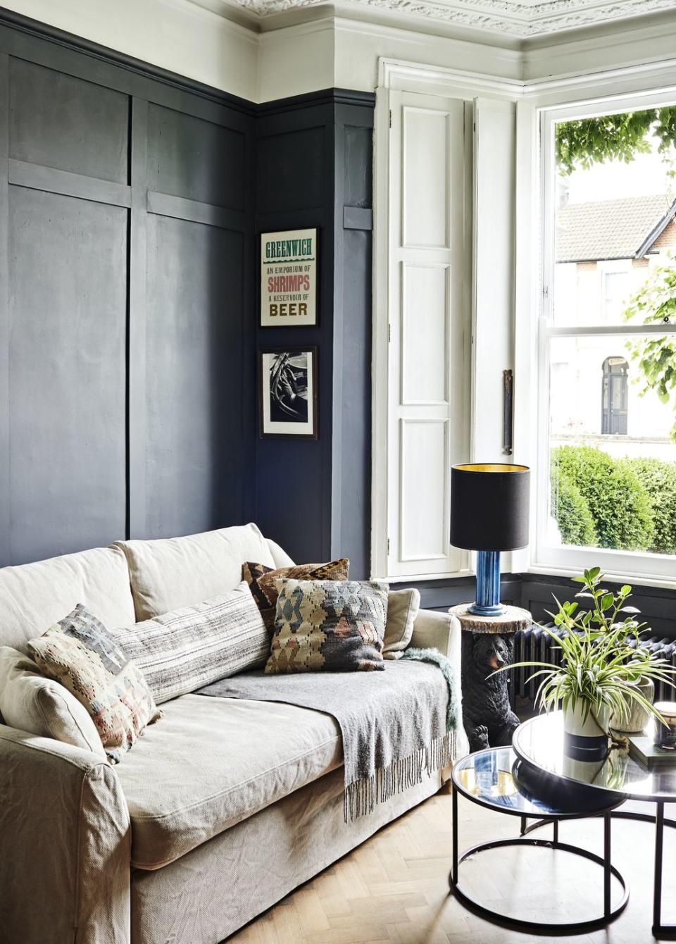
Monochrome
This is a classic design route for living rooms, and it won't steer you far wrong. Stick to a grey, black and white palette, and introduce some cheerful notes – the graphic posters draw the eye here, so too do the patterned cushions and hints of green. The eggshell finish on the feature wall is a great way to brighten and lift such a dark colour.
Read more: 25 clever feature wall ideas
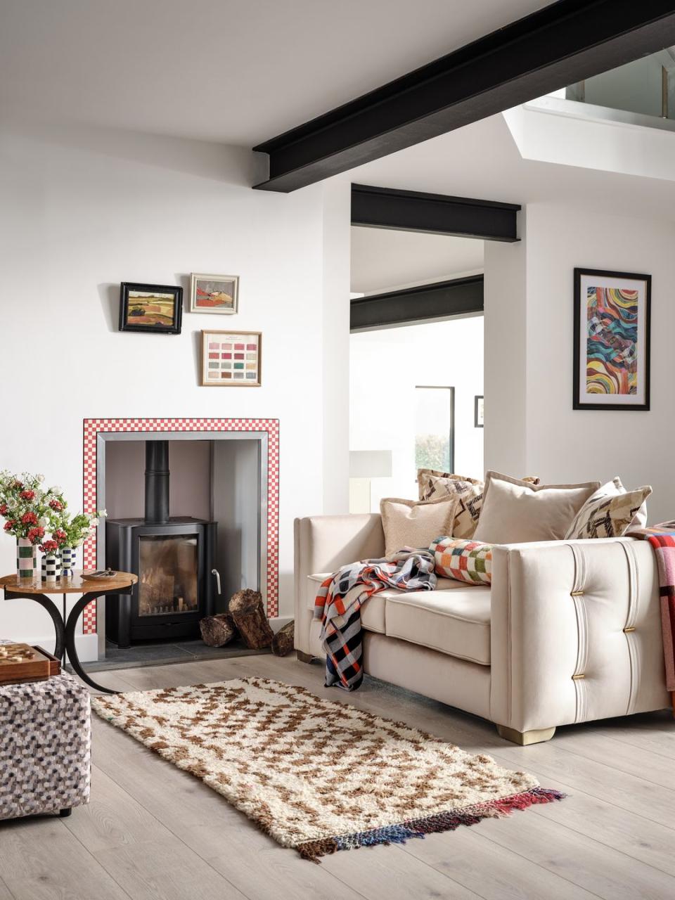
Seventies brown
The 70s are really having a moment in interior design with the laidback styling, natural materials, and earthy tones of the era creating something relaxed and homely. Dark woods – especially wood clad feature walls – shaggy rugs and lacquered furniture are favoured for their retro references.
Pictured: All furniture and homeware at H&M
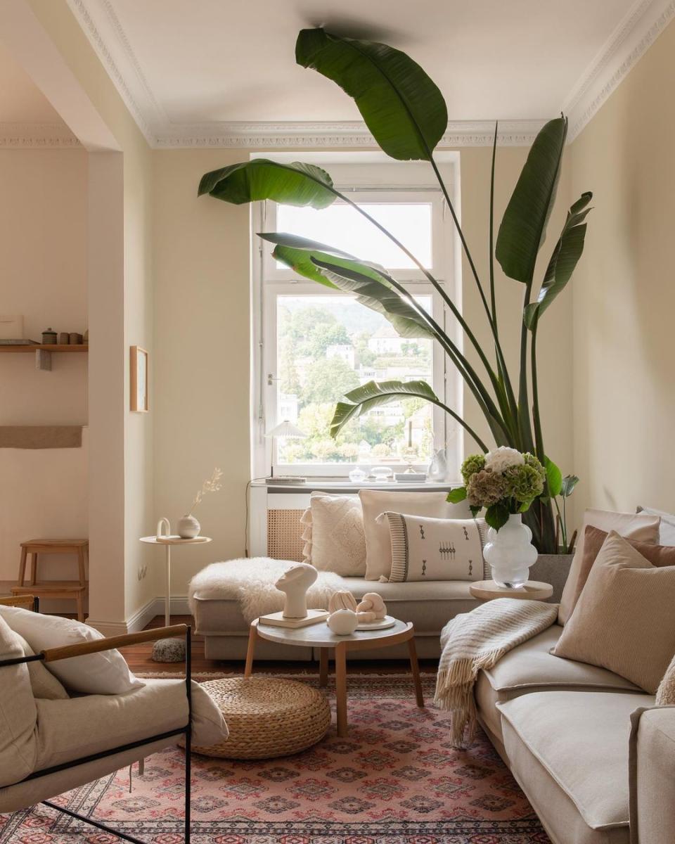
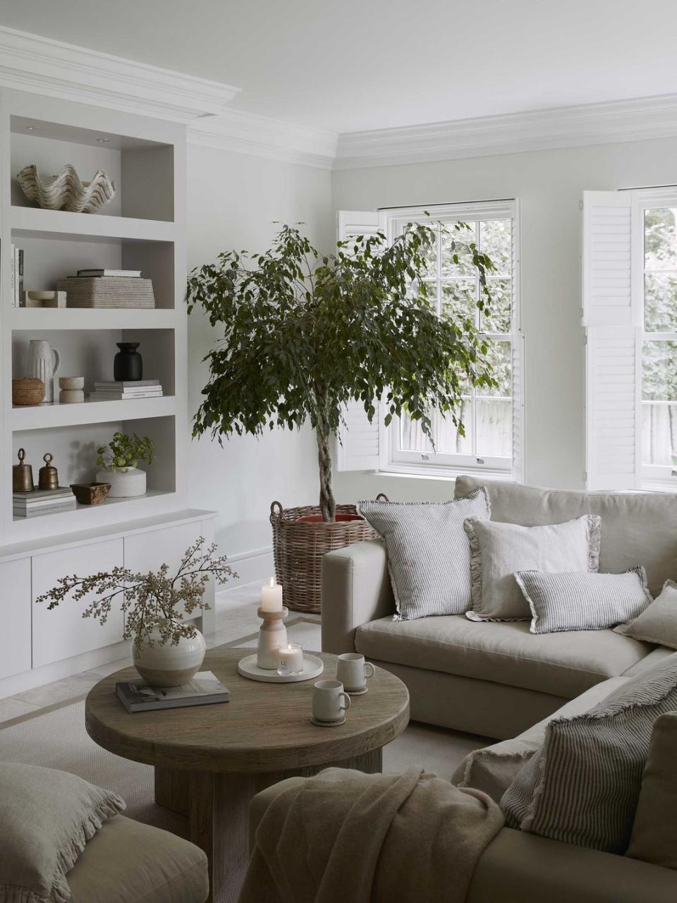
Comforting whites
Forgoing colour for a white on white living room can look really calm, clean and pristine. Remember that white is very responsive to both natural and artificial light, so when decorating with white, work with your room rather than against it.
Pictured: Walls painted in Dulux Heritage Romney Wool
Read more: The best paint colours for north, south, east and west-facing rooms
Grey and pink
When choosing a living room colour, always consider how undertones interact. One of the joys of decorating with grey is how susceptible it is to the influence of other colours – use grey against a putty pink for instance, and it will bring out rosy undertones.
Pictured: House Beautiful Luna Moonlight Rug at Carpetright
Read more: 21 grey living room ideas to inspire an update
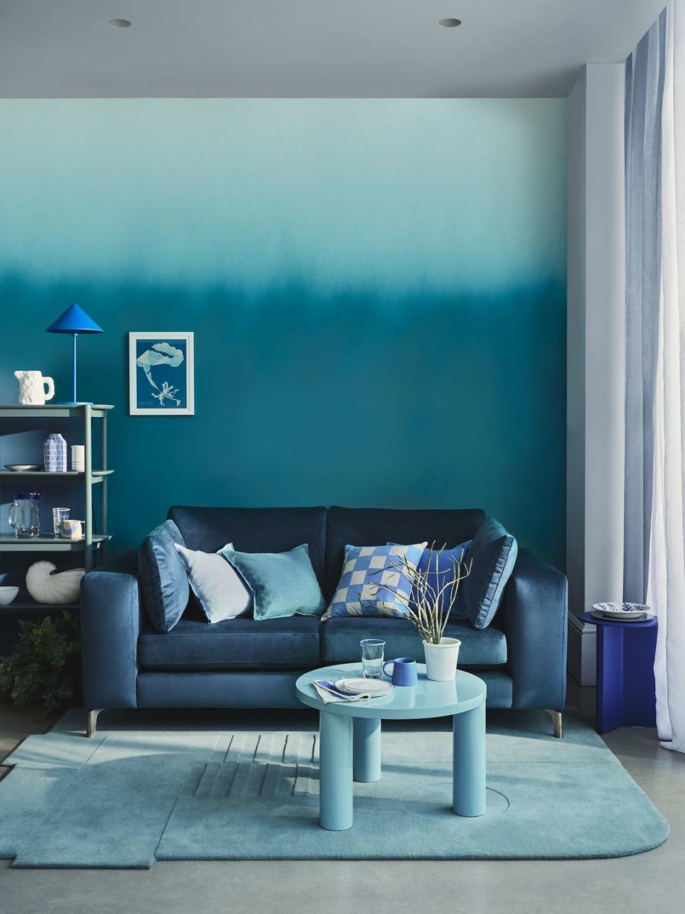
Feature blues
An ombre wall is a really impactful idea if you're decorating with a tight colour palette. This living room wall mutates from a deep ocean blue through to a turquoise and finally a barely there white/blue. But no DIY here; an ombre painted feature wall is very much one for the experts.
Pictured: House Beautiful Darcy Sofa Bed at DFS
Read more: Clever feature wall ideas to transform bland walls
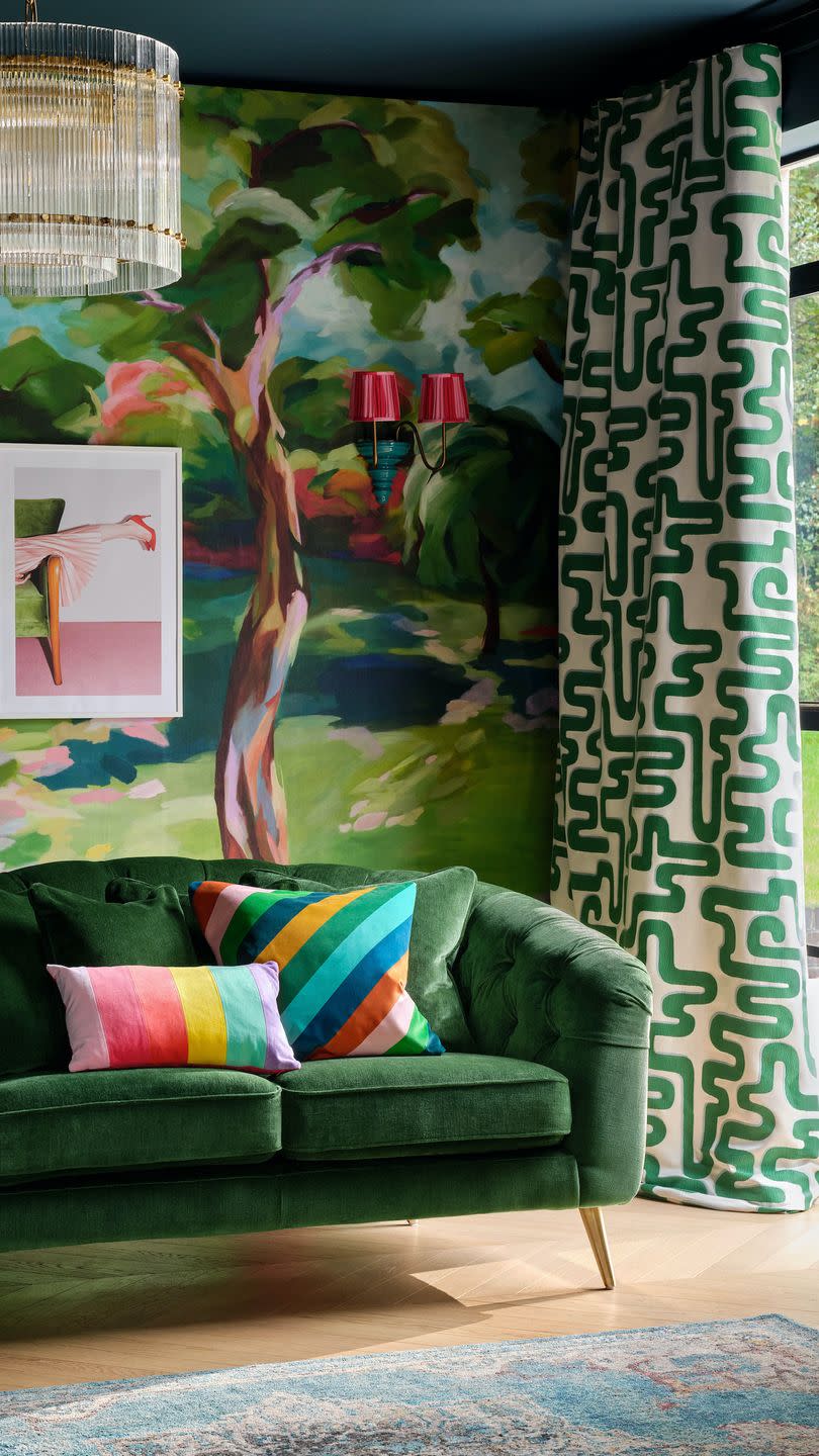
Jewel tones
Jewel tones always work brilliantly together because they all share such rich undertones – the same applies to pastels that all share white undertones. This is certainly not a restful choice, but rather for those who feel invigorated by colour.
Pictured: Bijou Sofa in Chamonix Highland Green Landrillo Mix at Sofology
Vintage
If you're considering introducing vintage pieces into your home, or if you've committed to shopping antique rather than new, there are certain colour palettes that will better complement the pieces you come across. You'll find a lot of dark wood and brushed brass in antique stores, and if you dip your toe into 60s or 70s design, you'll find a plethora of warm oranges, reds and browns. Sticking to a warming palette of plaster pinks or taupes in your living room will create a really natural and complementary canvas.
Pictured: Pipe Dreams Chair upholstered in Yolk & Salsa fabric, Colours of Arley x Jess Alavi-Ellis
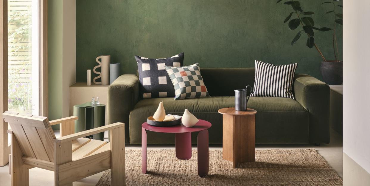
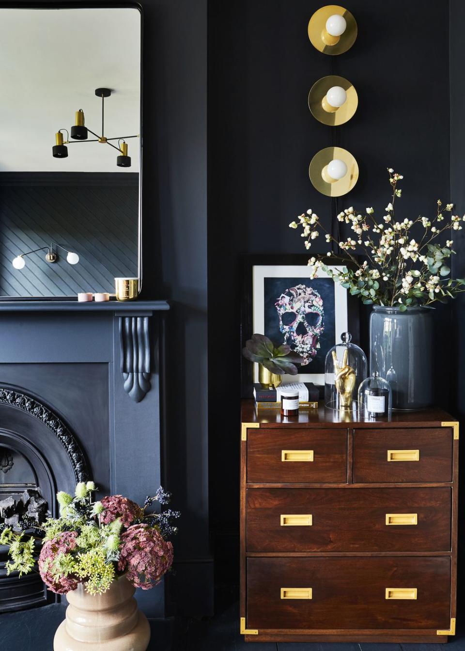
Black on black
A dark on dark colour palette can be a daunting choice in a space you use so regularly, but it works particularly well if you have lots of interesting architectural details like fireplaces, wall panelling or cornicing. They will catch the light and create some lovely highlights and shadows – a clever design device that prevents dark colours from looking flat.
Read more: How to use black accents in every room in your home
Cream with colour
If you like the idea of using intense pockets of colour – similar to the colourful rug, throw and fireplace surround shown here – then a neutral cream in your living room will provide the perfect canvas. An equally colourful wall or sofa in this living room would be overpowering, but a neutral is always a safe choice.
Pictured: Titan 2 Seater Pillow Back Sofa and Footstool, both at Sofology
True white
True white – often referred to as 'landlord white' for its overuse in rental flats – is largely avoided by designers because it offers no warmth whatsoever. It can work however in a home with lots of artwork and sculptures – true white is used in art galleries and museums because it allows works of art to stand out so prominently, so the effect can be replicated in your own home.
Read more: A guide to choosing white paint
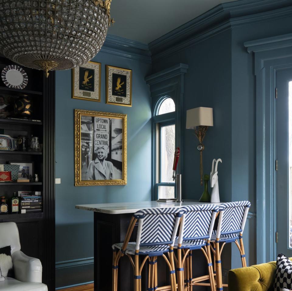
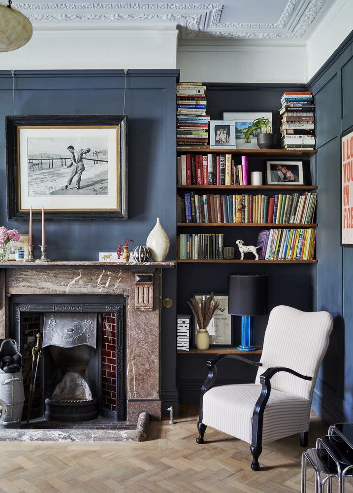
Studious blue
An inky blue-black used on panelled walls has something of a serious quality that is reminiscent of academic spaces like libraries or offices. It makes a nice choice for reading nooks and as you can see here, can be coupled with black without looking too heavy or dark. This effect would work best where there is ample natural light.
Read more: Blue living rooms: 21 fabulous ideas to inspire a makeover
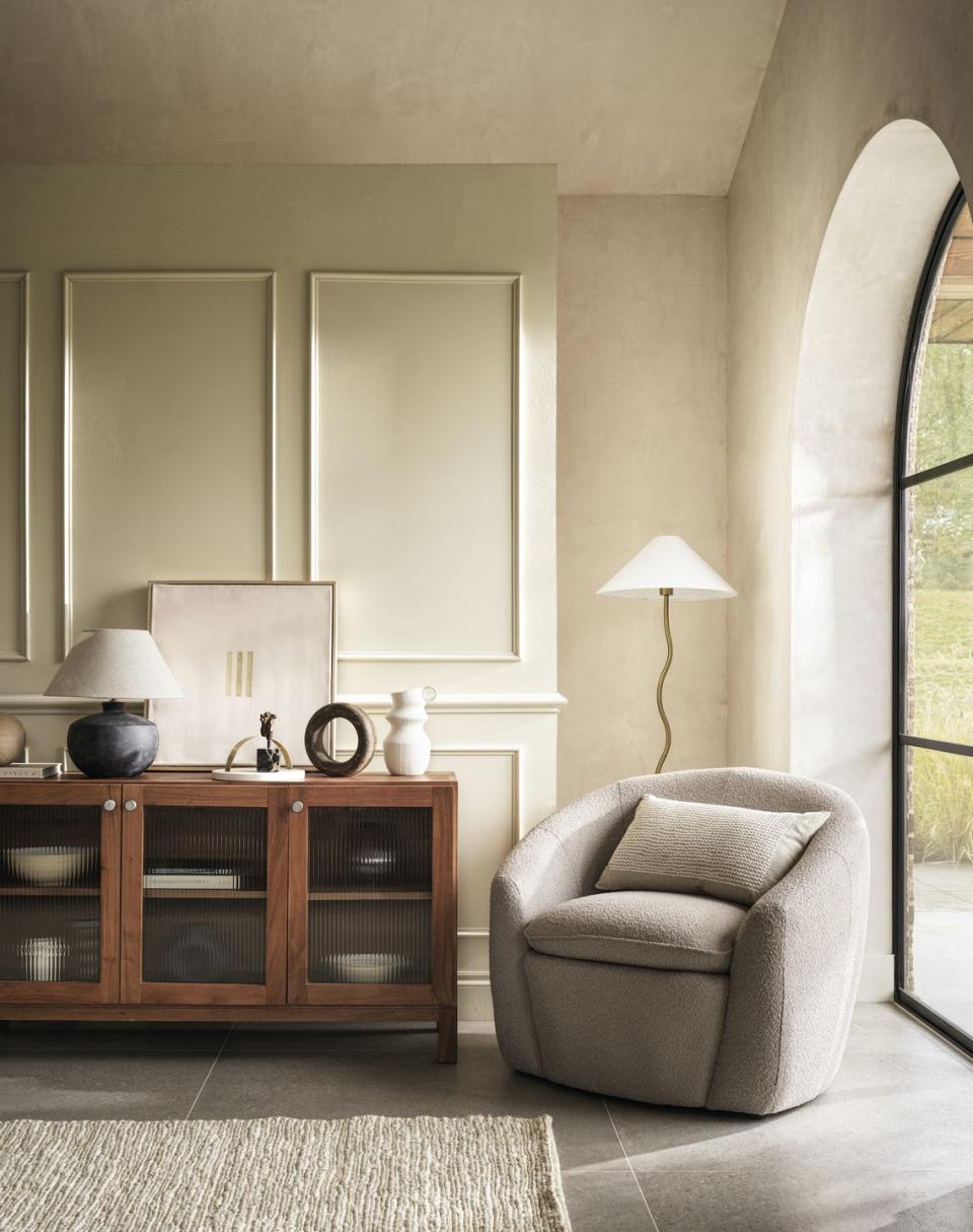
Limewash
Greys and beiges tend not to react to natural light in the way that warmer colours do, and so a common complaint in more neutral living rooms is that walls can appear flat. To mitigate this, consider a wall treatment that adds a bit of texture and dimension like a limewash.
Pictured: Curve Armchair, Hallie Floor Lamp, Langham Sideboard and all accessories at Marks & Spencer
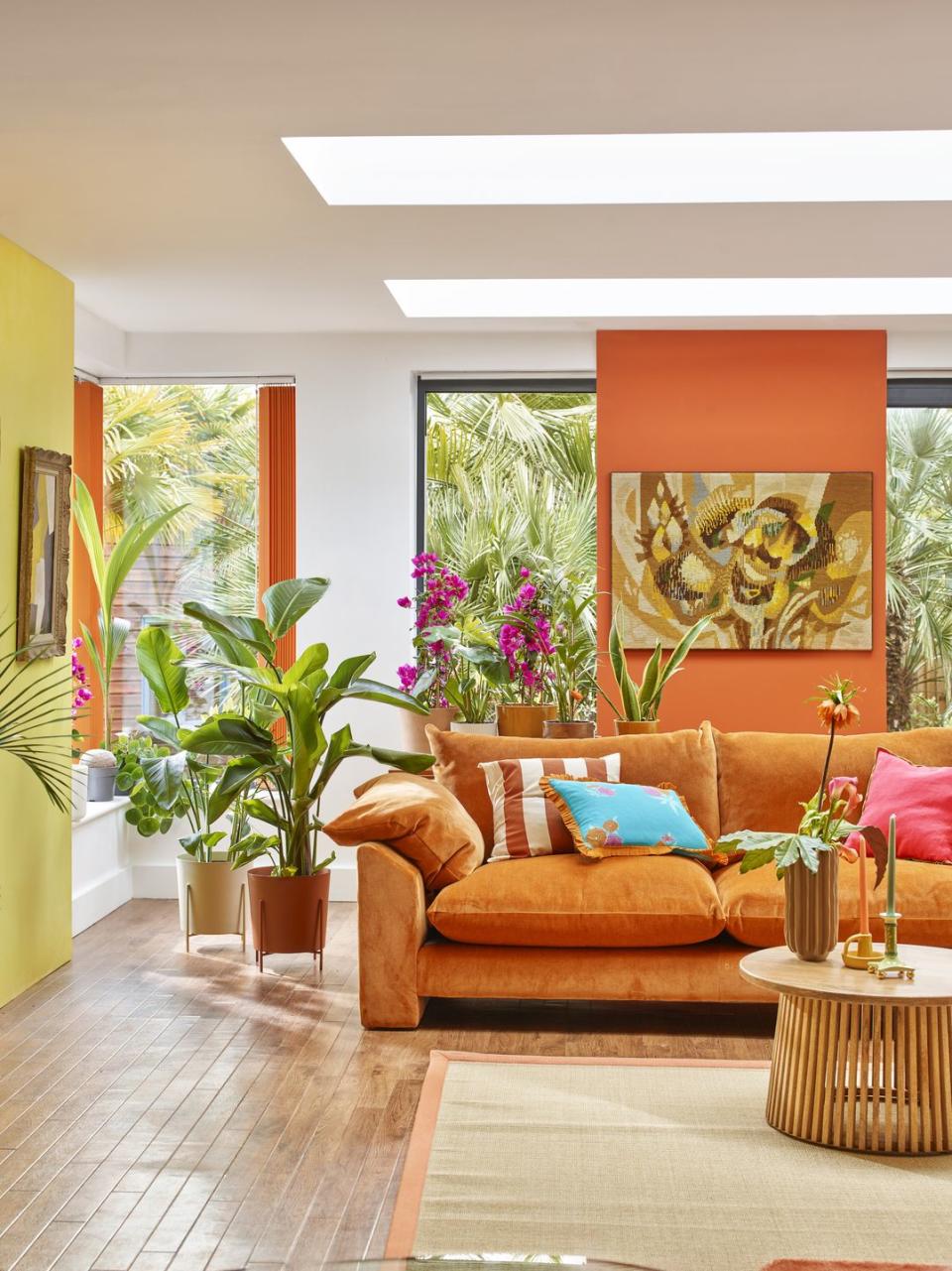
Tropical orange
For those who feel invigorated by colour. This tropical living room uses bright and citrusy shades to create a holiday at home feeling – and of course the abundance of greenery only serves to enhance the effect. The pop of electric blue is so welcome against a canvas of warm shades.
Follow House Beautiful on TikTok and Instagram.
You Might Also Like

