

TikTok's viral 'unexpected red theory' explained
The 'unexpected red theory' is the latest buzzword making the rounds on social media. Coined by interior designer Taylor Simon, it's defined as 'adding anything that's red, big or small, to a room where it doesn’t match at all – and it automatically looks better'.
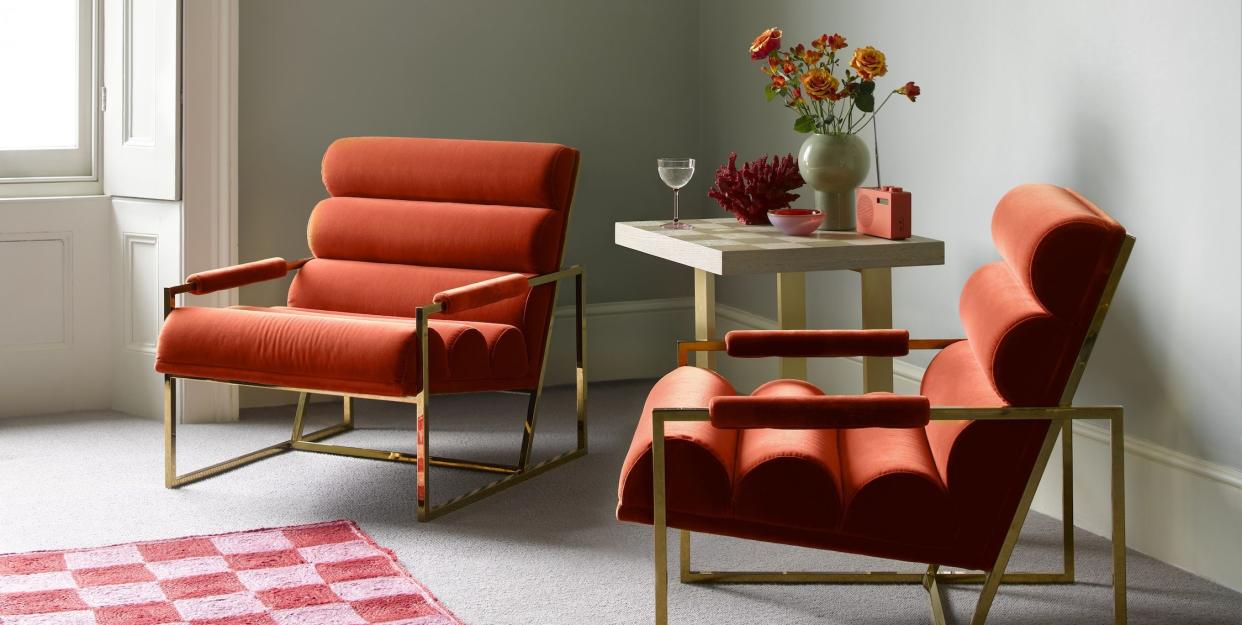
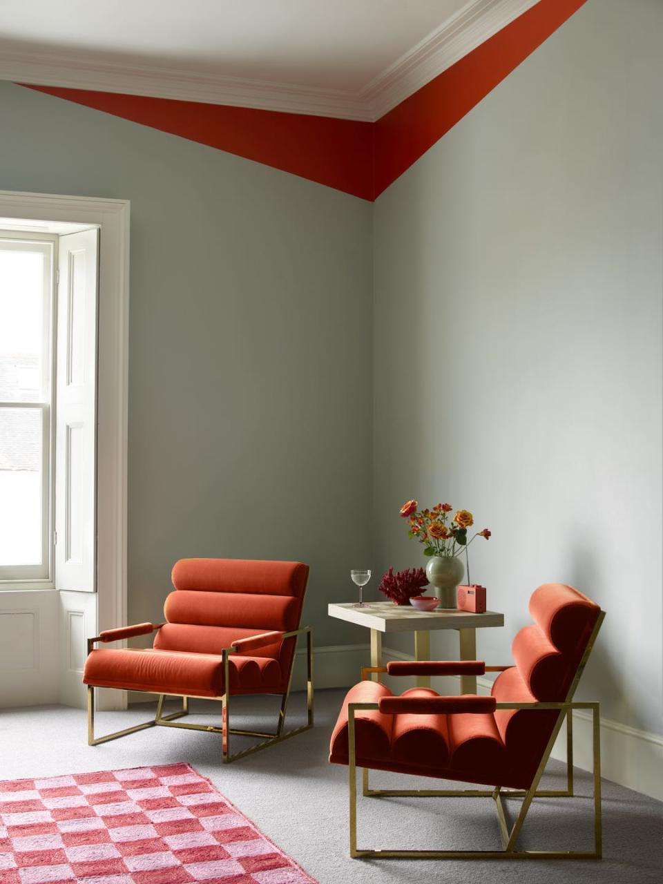
The theory champions using red in spaces where it simply has ‘no business’, from incorporating a few small tasteful touches (like lampshades), or bigger furnishings (like sofas and tables), or even going all-in by using red paint on walls. Simply add a little bit of red, where it's least expected, to spark joy and intrigue.
A trend? Yes, but a timeless one
TikTok has been known to amplify interior trends: so far in 2024 we've had bookshelf wealth, the mob wife aesthetic, quiet luxury is back again, and now the unexpected red theory is one of the newest trends to emerge following Taylor's now-viral video. It ties in with another trend, 'pop of red', which, although more closely aligned with fashion, explores the power of red to transform an outfit in an instant – much like interiors.
'Adding a focal point to a room is a must for those wanting to inject their home with extra character, whether that’s through a paint effect, painted furniture, wall art or accessories. The unexpected red theory is a brilliant example of doing just that,' says Justyna Korczynska, senior designer at Crown Paints.
Colour psychology
One for the fearless decorator, red lends itself to bold design schemes. Fiery and warm, red is a primary colour which denotes power, sensuality and vigour, and is often used as an accent colour in textiles or furniture. Granted, too much red can overwhelm a space, but the right shade can raise your energy levels, leaving you feeling stimulated and invigorated.
Is red the new neutral?
Taylor points out that the unexpected red theory should be treated more like a 'rule of thumb' rather than a trend, and we agree. So is this just about putting red back on the map? The theory promotes red as a versatile shade, on par with timeless neutrals, because it can work in almost any palette of colours and materials, either as an accent or a complementary tone.
Although, design experts have been championing this for quite some time. 'Red can be confident and charismatic, or rich and sensuous. The range is wide, making it a surprisingly versatile hue; from fiery red to maroon to terracotta, meaning you can find a hue that suits your personal style and home aesthetic,' says Helen Shaw, director of marketing (International) at Benjamin Moore.
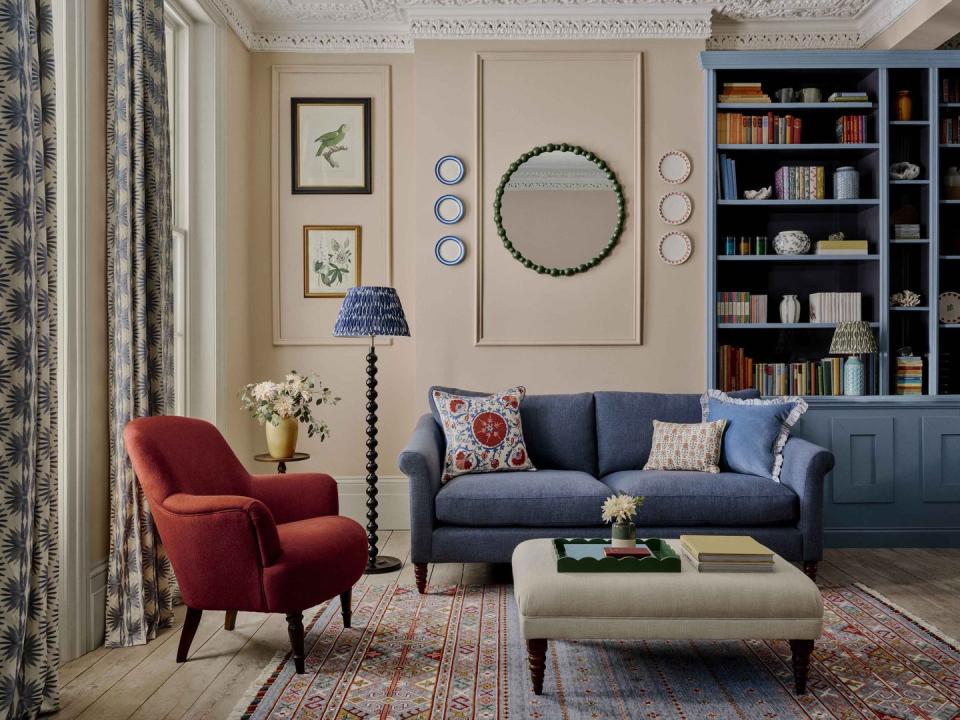
In a dining room, red stimulates the appetite and encourages conversation, while a living room with a neutral palette is the perfect canvas for scarlet tones.

Stephanie King, creative lead at Dulux, is also a fan of decorating with red in the home. ‘I have a red table in my living room – it adds such a vibrancy to the space,’ she says. ‘I’m a big advocate for red in a living space, especially when it is complemented by other warm tones.
'The earthy palette of reds, oranges and pinks is just like one big cosy hug; and is a softer way to introduce braver hues into your home. Whether the red used in your living spaces adds a striking contrast to the rest of your decor, or blends in beautifully with it, the introduction of red instantly gives that comforting, by-the-fire feel.’
Bold doesn't have to be daunting: A bright red will add drama to a room, perfect for hallways and dining rooms, while a soft, earthy terracotta will create a laid-back feel. For a more luxurious look, opt for a deep red, or a rich burgundy for that cosy, lived-in look. Orange-based reds are the more cheerful shades and perfect for small spaces.
It even works in the bedroom
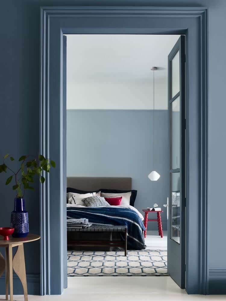
We know the hugely beneficial impact of decorating with blue in the bedroom, but what if you want to be a little experimental?
'Spaces for rest don’t often call shades of red to mind – but isn’t that what the unexpected red trend is all about? Using striking pops of the colour to contrast with calming blues, like Dulux Heritage Blue Ribbon and Boathouse Blue, is a great example of how to use the unexpected red trend in truly the most unforeseen way,' says Stephanie.
Get creative with paint
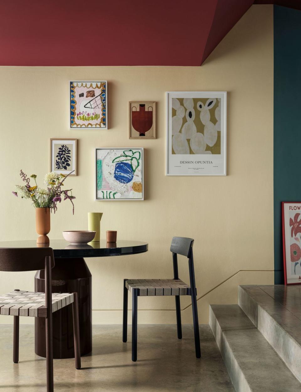
Red doesn’t have to be used all over to make a statement, but if we look beyond accessories and soft furnishings, it can be used more widely, perhaps as a feature wall. For a contemporary look, use flashes of red on architectural features, or create elements of interest in a room with modern blocks against a white background.
'Unrestricted by existing architecture or "boundaries", use masking tape to play with angles and introduce unexpected geometry to a corner, creating your own modern take on coving in a fearless, eye-catching colour such as red. Pair with furniture and accessories in the same shade to lock the scheme together,' explains Helen.
Keep it warm, not cold
Although a rich colour, 'reds can sometimes be a little cold, catching your eye harshly as you scan a room', warns Justyna. 'With this in mind, warm-toned, deeper red hues such as Crown's Velvetine are a great choice for those wanting to incorporate the unexpected red theory into their decor, helping to maintain the warmth of a room while adding a splash of colour and intrigue.'
And red works in small spaces too
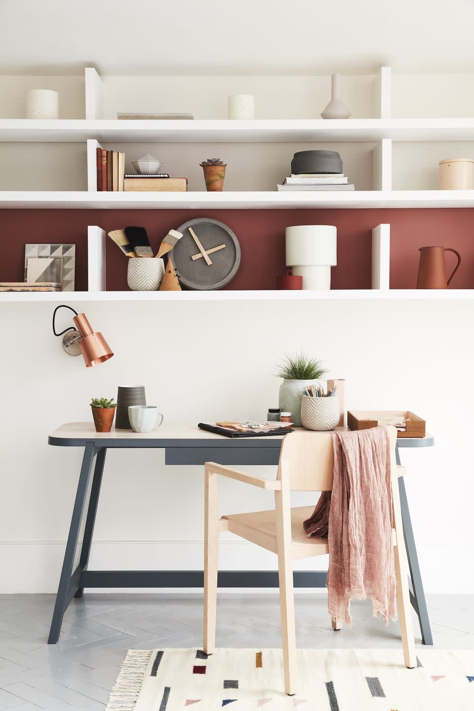
Remember, there are no rules when it comes to the unexpected red theory. 'Dressing spaces, offices, and vanity areas can be given a boost of energy with a red,' says Stephanie. 'Reds with pinkish undertones – like Dulux Coral Flair – inject a bit of playfulness and help you feel like your most confident self. This makes it ideal for rooms where you like to envision the perfect outfit, or you are in need a bolt of inspiration to get you through the working day.'
Follow House Beautiful on TikTok and Instagram.
You Might Also Like

