
What’s the Most Popular Color of Your Generation?
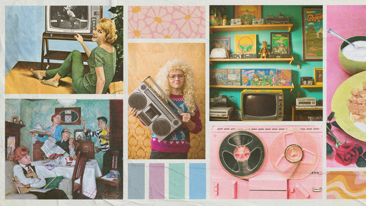
Colors speak volumes and can reflect the times we're living in without much explanation. You can't see burnt sienna without hearing a song by Fleetwood Mac or David Bowie playing in your head like a record player. When we look at our homes and the many decades they've gone through, the colors within have changed as much as we have over the years. The history of our interiors is captured in photos or our favorite TV shows and movies as if hitting pause on an era (Carrie Bradshaw's bright blue walk-in closet is a scene-stealer). These moments in pop culture and design reflect and tell the story of the events of their time. Like all things in design, colors and trends jump from one point on the timeline to the next.
At House Beautiful, we've been experts at celebrating colorful homes since 1896. Our obsession with color in home design has kept us on the edge of our seats while awaiting color of the year reveals and pondering whether the beige takeover of the '80s is on its way back with the quiet luxury trend. We asked interior designers Caren Rideau of The Kitchen Design Group in Pacific Palisades, California, and Bethany Adams of Bethany Adams Interiors in Louisville, Kentucky, to reflect on the colors we've seen come and go and the colors dominating this decade so far. Join us as we scroll back seven decades to the most popular colors impacting furniture, home decor, and more.
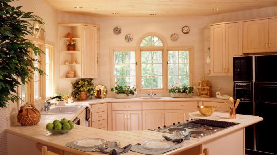
1950s: Pastel Parade

After World War II, picture-perfect homes and the baby boom swept the nation. Pastel hues like peachy pink and mint green suited a suburbia longing for an escape from the harsh realities of war. From cars and fashion to episodes of I Love Lucy, the candy-colored palette represented domesticity and optimism for the future.
Rideau: Pastel colors were big in the 1950s, especially light pink and minty pistachio green. These colors were even popular in appliance colors. Although considered part of a vintage era, they've circled around into today's time, which makes them timeless.
Adams: The postwar era was all about embracing fun and lightheartedness in decor. Colors like mint green, bubblegum pink, and cotton-candy blues were in every home—specifically the bathrooms. The postwar home-building boom may also explain the ubiquity of certain colors as builders were likely to buy materials in bulk for spec homes.
1960s: Punchy Colors
The wave of psychedelic and acidic statement-making colors reflected the counterculture of the time. At the height of social justice and revolution, there was no shying away from making bold choices that disrupted the norms of the previous decade.
Rideau: This was the era of bolder colors, such as orange, pea/avocado green, and warm yellows. These colors defined midcentury colors, and even today when seeing these colors together they define midcentury in America.
Adams: The idea of individuality in design is starting to catch on, and the candy-colored hues of the 1950s start to give way to deeper versions like raspberry and teal. Wildly colorful wallpapers are also bringing these colors out of the bathroom and into the main living spaces.
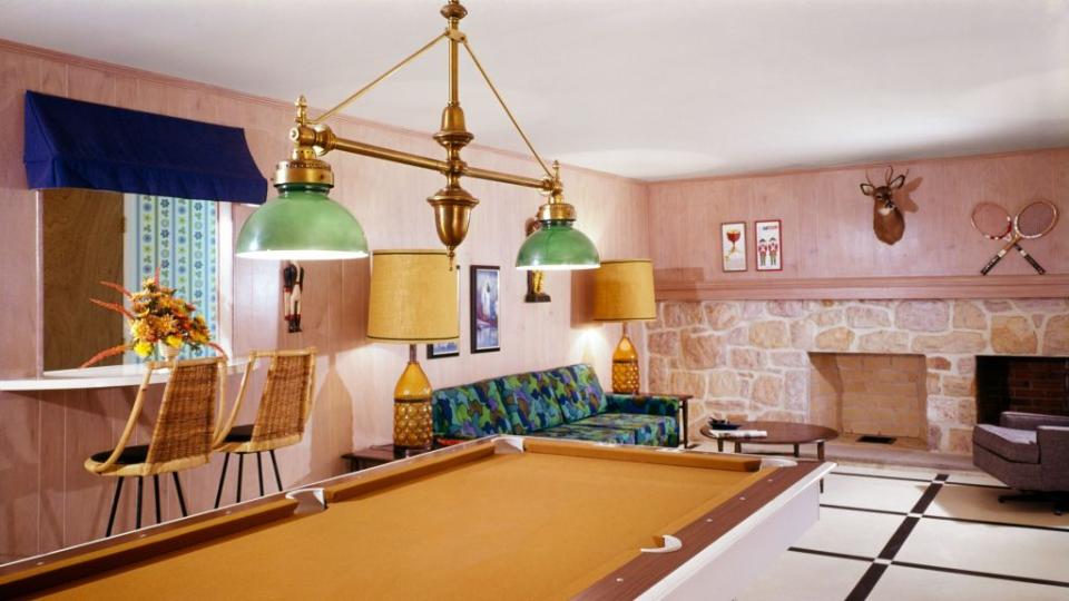
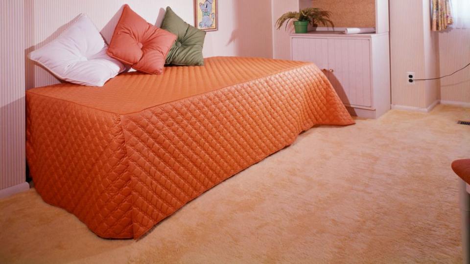
1970s: Getting in the Groove
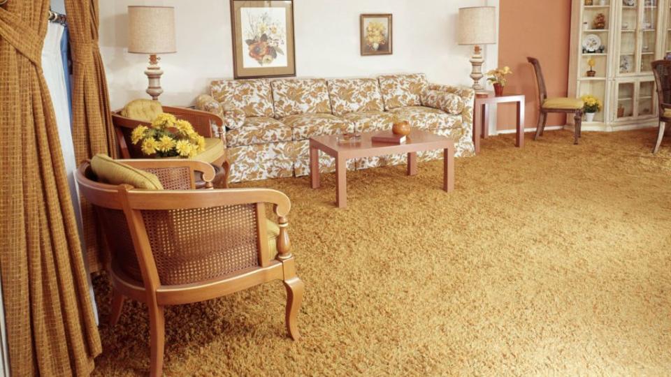
Homeowners wanted to feel connected to nature and chose earthy tones like burnt sienna, harvest gold, avocado green, and brown. After decades of romanticism and seeing interiors through rose-colored glasses, these comforting colors added warmth to interiors. Self-expression and bohemian styling are evident in shag rugs, macramé, houseplants, and wicker furniture. Even appliances got a makeover in avocado green and harvest gold!
Rideau: This era of retro was defined by jewel-tone colors like kelly and emerald green, mustard yellow, and pops of burnt orange. This was also the era when avocado green and harvest gold were introduced in appliances, carpets, and wall coverings.
Adams: In the '70s we started to see a backlash against pastel hues, and homeowners started leaning toward nature-inspired colors like avocado green and harvest gold. The exciting part was the colors weren't limited to the bathroom this time—you could get a suite of avocado green kitchen appliances!
1980s: Maximalist Makeover
The environmentalists' stint was brief as economic change and pop music couldn't be restricted to muted tones. Electric colors like turquoise and neon pink took center stage, and the Memphis design movement from Italy followed up as the second act. Excessive shopping was a result of advertisements enticing homeowners to buy into bright colors and entertainment, with MTV and video games becoming the focus of pop culture.
Rideau: This decade was "out with the heavy earth tones of the '70s and a resurgence of bright intense colors." I feel the color was expressed through flowers and nature.
Adams: By the '80s everyone had tired of their drab kitchens, and we started leaning back into color: teal, fuschia, and always a hint of black.
1990s: Grunge, Metal, and Tech
And let the beige rage begin! This decade tossed vibrant colors aside and leaned into muted, neutral tones at the end of the Cold War. The pace slowed down for design choices with a raw edge like exposed brick walls and industrial-style apartments. The color that minimalists could agree on was green, specifically Restoration Hardware's Silver Sage.
Rideau: This decade represented pastel earth tones and a Tuscan-style influence with red, browns, and beiges.
Adams: Finally, by the '90s we were all chromatically exhausted and starting leaning toward light colors like beiges and grays. An amazing new store known for selling period-appropriate hardware came out with its own paint line, and we flipped for Silver Sage.
2000s: New Finishes

Thrifting and shopping vintage brought back individualism in a new way. Homes took on more of a layered, lived-in look with personal collections on display. Colors skewed to the safe side with beiges and yellows, but finishes like Tuscan stucco, granite, and stainless steel were the accent pieces. While there was a return to bringing antique pieces into the home, this decade also was filled with advances in technology from the internet upgrade to the iPod.
Rideau: The 2000s brought in a sense of calmness in the new millennium, such as light brown, tan, and, near the coast, shades of white, blue, and blue-gray were very popular.
Adams: The early aughts found us rediscovering the period of design known as "mid-century modern," and we painted everything in pale aqua and decorated with hints of lipstick red and bright lime. Bonus points if you put a bird on everything.
2010s: Gray Wave
There wasn't a living room untouched by a shade of gray. From the walls of the bedroom to the cushions of your sofa, gray was the heralded neutral hue of the time. The color fit in with just about anything! But the color that swept over the gray for design lovers was millennial pink. By the middle of the decade, the cult following for Chip and Joanna Gaines (one word: shiplap) brought white kitchens and farmhouse style to popularity.
Rideau: In combination with the calming colors of 2000, hints of bright colors were introduced, like turquoise and jeweled greens influenced by the tropical waters.
Adams: It seemed crazy at first, but by the end of this decade "Millennial Pink" became as neutral as gray. We can be annoyed by millennials for plenty, but we all owe them a debt of gratitude for bringing this universally flattering hue into our homes.
2020s: Color Forecast
Where to next? The 202os have been filled with blues and lavenders to represent modernism and the digital age instead of playing it safe with gray. The post-pandemic era thus far has silenced the noise from fast fashion and design and prioritizes quality materials and natural finishes instead. Consumerism has turned from buying brand new to choosing items that lessen the carbon footprint: antiques, sustainably made pieces, and secondhand and upcycled finds.
Rideau: This era to date has become more timeless and regal with navy blues, dark greys, and of course tone-on-tone of whites and off-whites.
Adams: It's early days, but I feel like this is the decade of blue. Not cotton candy, not teal, not aqua or gray—just rich, saturated blues. It's a color that promotes rest and recovery, and after the first years of the 2020s I think we could all use that.
You Might Also Like

