We Ranked the 40 Best Colors to Paint Your Living Room
- 1/41
We Ranked the 40 Best Colors to Paint Your Living Room
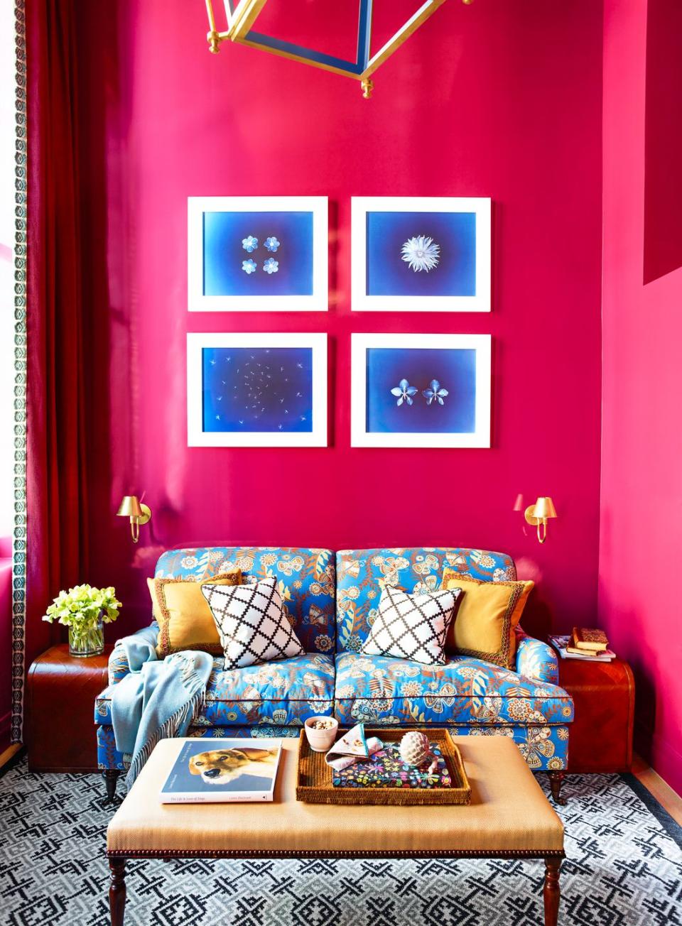
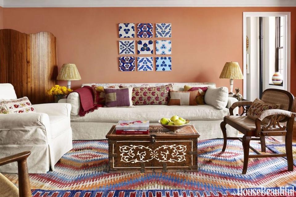
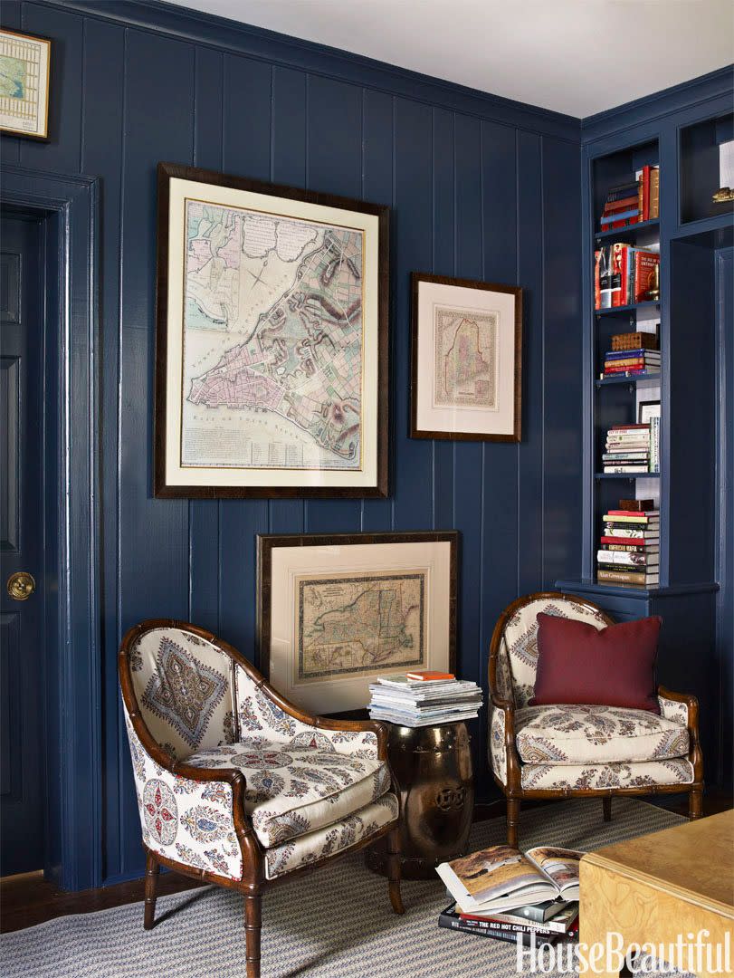
Your living room is probably the most popular room in the house, so decorating it to make sure it's a place you actually look forward to spending time in a must. And that brings us to color, since coming up with a flattering palette will likely drive the design process and set the mood for years to come. Whether you want something bold and bright, neutral, or moody, we've got tons of living room paint color ideas for you to get inspired by ahead. All you have to do is put on your overalls and grab a roller—the hardest part will be deciding between all these designer-approved living room colors.
🏡You love finding new design tricks. So do we. Let us share the best of them.
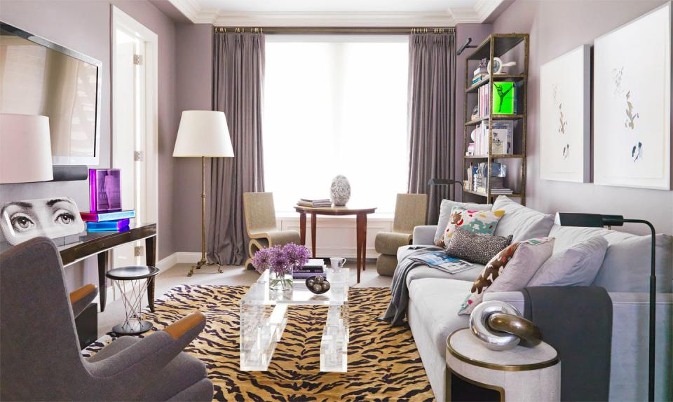
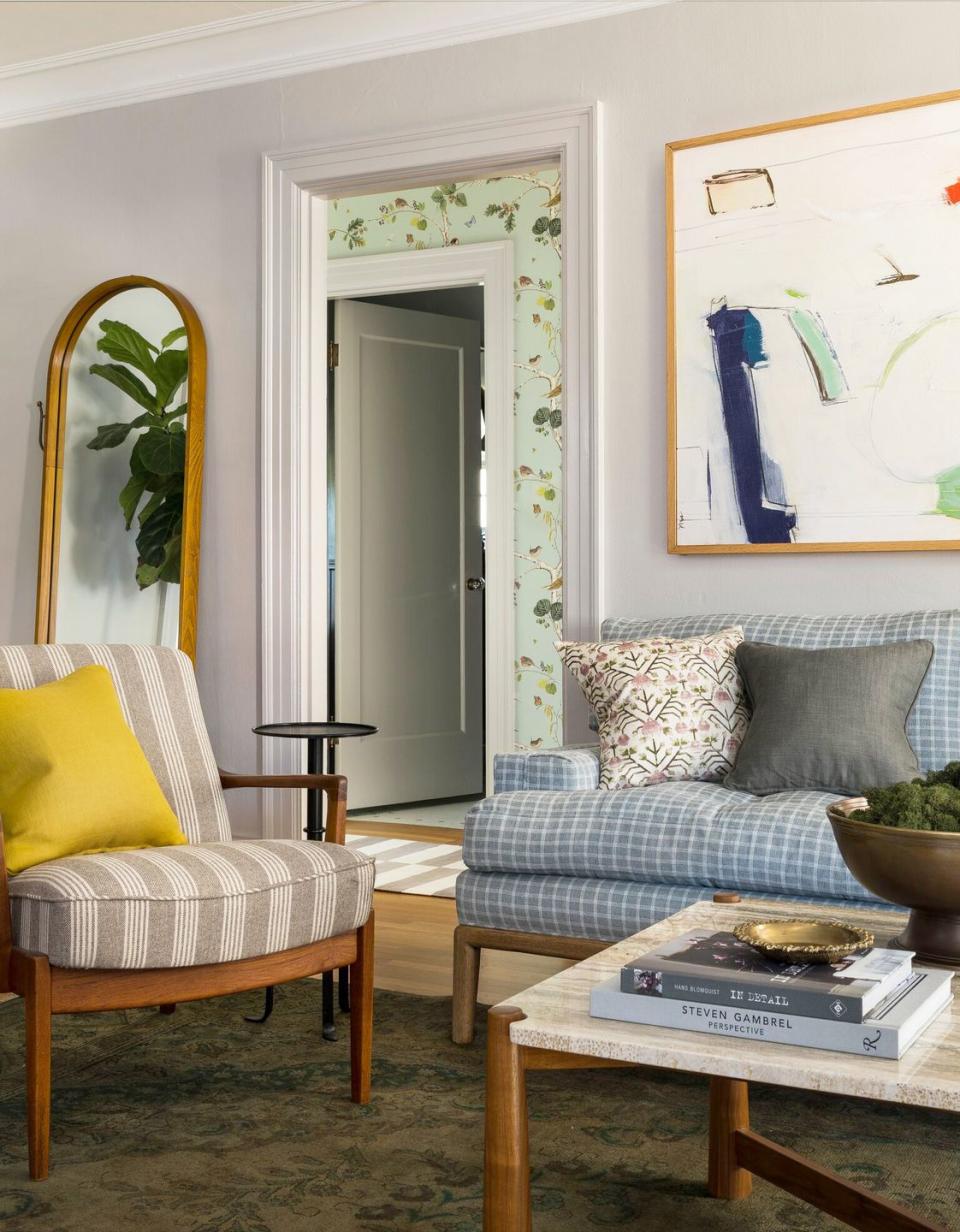
Thomas Loof - 2/41
Sunny Yellow
Does the thought of painting your living room yellow scare you to your very core? How about now that you've seen this timeless and cheerful living room designed by Michael Maher? Personally, we're about ready to repaint our own after one glance at this space. It radiates warmth and offsets the cool blue tones.
Paul Raeside - 3/41
Charcoal
The traditional and neutral furniture in this room designed by Balsamo Antiques and Interior Design make a minimal visual impact so the moody colors, artwork, light fixtures, and other decorative accents can stand out. And while it may not be as simple or popular, a deep dark, almost purple-gray tone turns out to be a wonderfully complex and evocative backdrop. So don't be afraid o try something different.
Bjorn Wallander - 4/41
Light Lime Green
Take note from the bold pattern mixing and modern artwork on display in this living room designed by Les Ensembliers. A light green color on the ceiling is an unexpected surprise that ties the whole room together. It pairs beautifully with the yellow curtains and darker geometric green ottoman and plenty of gray tones throughout.
Paul Raeside - 5/41
Peach
The open floor plan in this Chicago family apartment designed by Bruce Fox called for cohesion between the dining and living room areas. That soft peachy paint and deep pink sofa are reflected in the printed armchair at the head of the dining table and also mimic the rosy glow of the pendant light. The color scheme was inspired by a photograph taken of the family in London during spring when the city was veiled in cherry blossoms.
Kendall McCaugherty - 6/41
Kelly Green Splash
"I love the juxtaposition between the traditional space and the modern staircase," says Eliza Crater of Sister Parish Design. The rich kelly green accent wall and decorative floral curtains help bring some fullness and warmth to the otherwise all-white surfaces.
Maura McEvoy - 7/41
Navy
Ann Pyne worked with decorative painter Arthur Fowler to create a geometric pattern on the walls. "I think of the puzzle-like shapes as a metaphor—it's a game of fitting all these disparate 'treasures' into a graphically coherent whole," she says. Matte navy blue and a gritty mustard-tone work together to set a pensive and seductive backdrop—perfect for a smaller living room.
Douglas Friedman - 8/41
Lilac
In this eclectic living room designed by Royce Pinkwater, a misty lilac color on the walls and curtains helps ground the lively animal patterns and sculptural furniture items. The soft pur[ple is subtle enough to function as a neutral and also has a somewhat sweet nature to it.
Thomas Loof - 9/41
Crisp White
A crisp, matte white is totally timeless. Sherwin-Williams Pure White is there for you when you just can't with trends anymore (see ya never, millennial pink).
Heather Hilliard - 10/41
Mint Green
This fresh color makes a room feel like a tropical oasis. In this room by Thomas Jayne and William Cullum, where the paint stretches all the way up to the high rafters in this living room, the hue changes depending on the way the light hits it, shifting between sharp mint green and soft sea foam green.
Francesco Lagnese - 11/41
Khaki
Designer Garrow Kedigian defines a neutral as "anything that isn't jarring," which is a super helpful way to reframe things if cream, white, or gray simply isn't cutting it in your living room and you can't figure out why. Certain spaces just call for something outside the box, whether it's because of an architectural style, light exposures, or existing furniture. Here, the walls are painted Benjamin Moore's Rattan.
Paul Raeside - 12/41
Coral
Interior designer Janie Molster says there's no such thing as too much pink, and we happen to agree—especially when it's emboldened by red and white striped furniture. But if you just want to dabble in the bright color, start by painting a smaller area in your home, like in pretty window nook. It gives a bit of a romantic glow without feeling like you painted the walls with bubblegum.
Bjorn Wallander - 13/41
Royal Blue
Not only is this deep blue paint a lovely and bold color for this living roomy by Kate Reid, but the high-gloss finish adds some extra punch. It's basically the color of wanderlust right in your own home. It'll make you feel like you're on vacation, even if the closest you're getting to an island escape is your laptop's screensaver (sigh).
JAMES MERRELL - 14/41
Ever-Changing Neutral
Designer Jae Joo opted for a soft palette in this 1885 Boston living room. The light pink armchair adds some youthful buoyancy to the dark wood pieces while also bringing out the warmer tones in the versatile neutral backdrop. In some lighting, it appears light gray-green and in others, a more beige hue.
Shade Degges - 15/41
Sage Green
Turn to nature and bring gorgeous shades of sage indoors. Green-infused grays feel like a breath of fresh air and add just the right touch of intrigue as a backdrop for the gallery wall in this living room designed by Tamsin Johnson.
Tamsin Johnson - 16/41
Steel Blue Gray
Interior designer Gail Davis chose a blue with gray undertones to complement the greige wallpaper. Then, she warmed up the cooler colors with deep caramel brown leather armchairs.
Gail Davis Design - 17/41
White and Marine Blue
It was a challenge marrying the two styles of his clients, designer Corey Damen Jenkins explains. “The wife loved jewel tones and embellishment, while the husband was on the total opposite end of the spectrum—no color, no wallpaper," Jenkins tells us. So the living rooms walls were painted in Garlic Clove by PPG, "which has enough warmth to counter balance the bright white of the often snowy landscape," while a door to the adjacent room got a splash of color with Navy Masterpiece by Benjamin Moore.
Werner Straube - 18/41
Violet
Why pick one fun paint color when you can pick two? We're loving the romantic yet surprisingly fresh color combination of fire engine red and violet in this space by Katie Brown. The bohemian embroidered throw pillows tie everything together nicely. That's another great way to approach the living room design process: Start with a fun pair of throw pillows and then pull out your two favorite colors to highlight on the walls and ceiling.
David A. Land - 19/41
Marigold
Before we even comment on paint color, can we just take a moment to appreciate that wild gallery? This marigold living room designed by Brockschmidt & Coleman is at once classic and quirky, unique and timeless. The walls are covered in Mustard Olive by Benajmin Moore and bordered at the ceiling in black.
SIMON WATSON - 20/41
Cream
Warmer than white but still neutral, cream is the perfect backdrop for an inviting yet formal living room. In this one designed by Jean Liu, the neutral, almost iridescent rug, velvet sofa, and brass accents are reflected by the paint color while the blue throw and white side table contrast with it nicely.
Stephen Karlisch - 21/41
Pistachio
Designed by Fiona Lynch Studio, this modern living room is a masterclass in how to use bold, offbeat colors with restraint. The lime wash pistachio wall and painted fireplace add just enough lightness and texture to make a statement but still feel minimalist.
Fiona Lynch - 22/41
Tangerine
These orange walls in this room by Matthew Bees provide a dynamic backdrop for artwork and an emerald green lampshade. It's unexpected, but makes the room feel so sunny.
Annie Schlechter - 23/41
Light Gray
In this charming family-friendly home, interior designer Heidi Caillier chose a light gray paint in the living room to play up the color scheme of the eclectic furniture and decor throughout. It's more complex and less stark than a classic white, but still neutral enough not to steal the spotlight.
Heidi Caillier - 24/41
Pale Blue
Pale blue walls give this living room designed by Heather Hilliard a calming vibe, while white ceilings help break up the blue and make the room feel lighter and airier. Meanwhile, the green lucite coffee table injects a funky youthful energy that livens up the sky blue backdrop and floral sofa without clashing with the traditional elements throughout.
John Merkl - 25/41
Bright Red
Pattern packed and bursting with vibrant energy, this living room designed by Krsnaa Mehta will inspire you to never hold back when it comes to color. For an especially bold statement, paint an accent wall bright red.
Bjorn Wallander - 26/41
Army Green
A moody shade of army green paint complements the mahogany wood details throughout the room while the sunny yellow sofa and pink layered rugs brighten up the space.
BG COLLECTION - 27/41
Powder Blue
Just looking at a blue room can slow your pace and calm you down. A monochrome palette allows us to focus on the incredible interior architecture and dramatic statement pieces in this living room designed by Robson Rak. The soothing tones and bulbous shapes throughout, from the marble side table to the bubble pendant light and rounded sofa, make it both understated and bold.
- 28/41
Black
Designer Kristin Kong hid a door to the basement behind millwork painted in Sherwin-Williams' Black Fox in her home near Atlanta. The trick "makes the room look less choppy," she says, since the dark color helps everything blend together. And never underestimate the power of a beautiful flower arrangement on the coffee table!
Maura McEvoy - 29/41
Griege
The griege paint color is much more complex than white yet still soft and neutral. The black marble fireplace anchors this living room designed by Arent & Pyke, which gets a contemporary lift from the jute rug, modern and bright artwork, and shapely table lamp. And because the armchairs are a classic silhouette, they'll last forever—you can reupholster them with different colors and prints throughout the years as your taste and style changes.
Felix Forest - 30/41
Hot Pink
Intense, eye-catching, and adventurous, the neon pink walls in this Greenwich Village living room designed by Katie Ridder (she used C2 Paints' Mulberry) are a bold choice that paid off. The contrasting sky blue tones and traditional furniture makes it more transitional and timeless. Use the shade in a foyer for a warm, welcoming, impossible-to-forget entrance.
Katie Ridder - 31/41
Raspberry
This room is simultaneously friendly and inviting, grownup and sophisticated. And while its berry hue is definitely bolder and brighter than your average cream, it also has a nice absorbing depth to it. The burnt orange and chocolate brown upholstered armchair speaks to the room's spirited personality, while the metallic gold tables and cool marble fireplace add polish.
Farr & Ball - 32/41
Deep Brown
In a Connecticut house designed by Philip Gorrivan, living room walls painted in Farrow & Ball's Tanner's Brown—with trim in Benjamin Moore's White Dove—set off an eclectic art collection and a classic Bridgewater sofa, covered in Josef Frank's Windows.
Maura McEvoy - 33/41
Blue-Black
Blue walls give this stylish cabin-like living room in a Heidi Caillier–designed home a surge of mystery. The down-to-earth materials and classic prints ensure a cozy cocoon-like atmosphere. The lesson? Dark walls will make any space extra cozy and intimate.
Heidi Caillier - 34/41
Crimson
Avoid the super bright reds and your house won't look like a fire station. A richer shade of crimson warms up this space by Katie Ridder, while contrasting furniture in pinks and blues helps break up the bold hue.
ERIC PIASECKI - 35/41
Pale Blue-Gray
"I intentionally chose a cooler gray because I knew I'd be mixing in blue and green pieces," says Rayman Boozer, the designer behind this bold room. It just goes to show that color can change so much depending on the pieces you pair it with.
manufoto llc - 36/41
Amethyst
Both the walls and ceiling of this room by Angie Hranowsky feature amethyst paint. Brighter pops of purple on the sofa and the Christopher Spitzmiller lamp give it a little contrast, so it doesn't feel too muted.
Annie Schlechter - 37/41
Ocean Blue
Designer Sara Story lacquered these walls in a custom ocean blue color. The shiny walls help bounce light across the space, giving a bright and open feel.
Björn Wallander - 38/41
Clay
This studio apartment by Sara Bengur has a personality all of its own. The warm coral walls set off the neutral and colorful decor perfectly.
Peter Murdock - 39/41
Purple
From the silver ceiling down to the cheetah print stools, this Hamptons house by Lisa McFadden lives up its glam location. Purple paint coats the walls in a high-gloss finish and the sofa is covered in velvet.
Christopher Baker - 40/41
Navy Blue
Painting a small living room a dark color can be helpful. It camouflages the fact that it's small, and ups the cozy vibes. Bonus? Navy blue is totally timeless.
Ngoc Minh Ngo - 41/41
Olive
If your style is more traditional, olive green might be the right move. It's also ideal for millwork and trim.
Eric Piasecki