

3 colours guaranteed to make your home happier
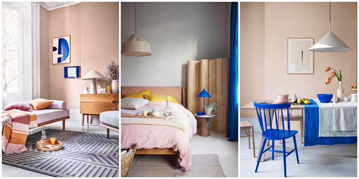
The days are getting longer and we’re looking forward to sunnier times, so how do we translate that feeling of optimism into our homes? With an uplifting trio of shades that are gorgeous on their own, but even better mixed and matched to bring out the best of each. Plaster pink, soft ochre and cool cobalt offer an elegant balance of neutral and vibrant tones. Turn the page for ideas guaranteed to up the happy vibes in your interior.
BLUES

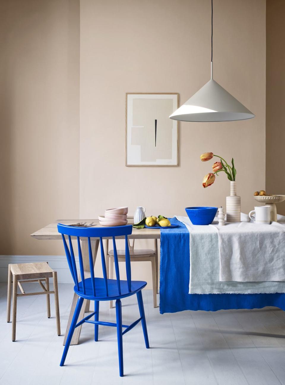
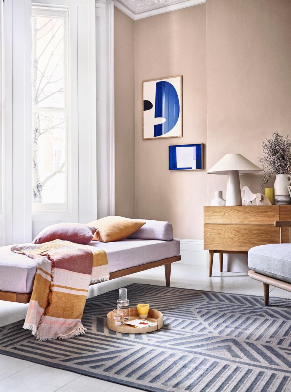
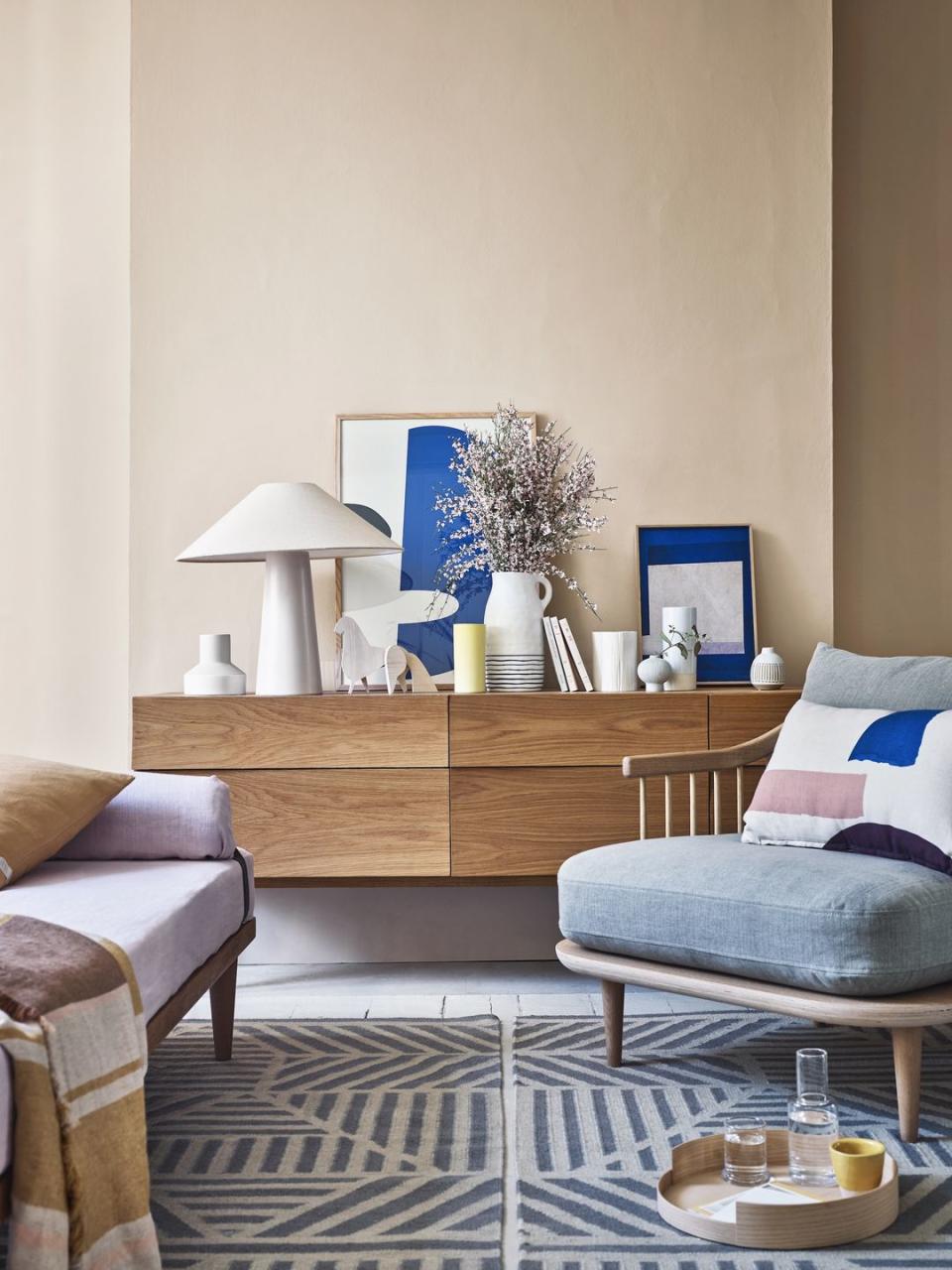
Cool cobalt pops
If you want to dial up the energy in your home – a good option in spaces where people gather, such as a dining room – cobalt is the way to go. Intense and vibrant, it works best when layered with softer, more subtle shades, such as plaster pink, where the contrast really makes it sing. Add as much or as little of it as you like, then ramp it up with lemony highlights for total zing.
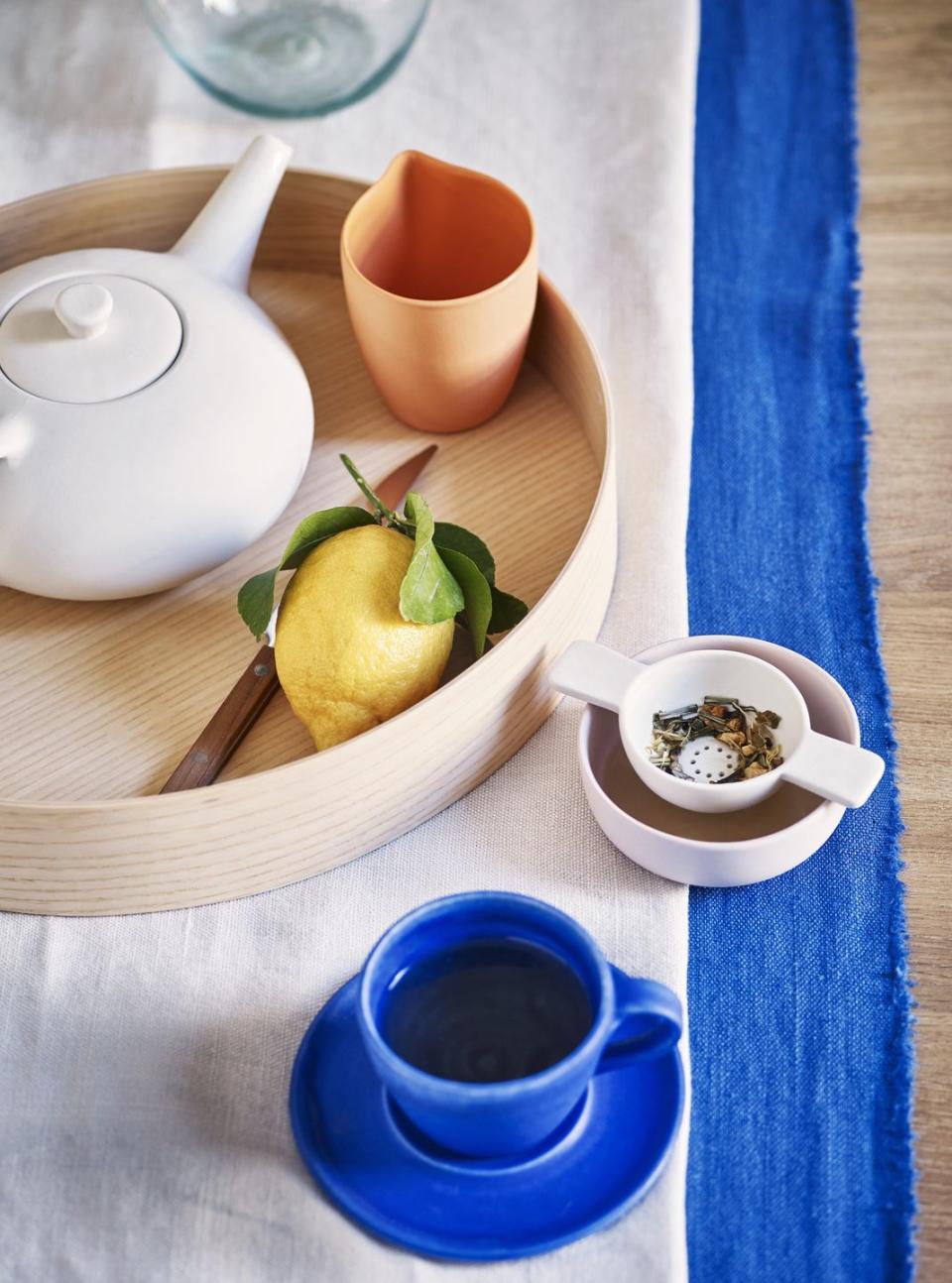
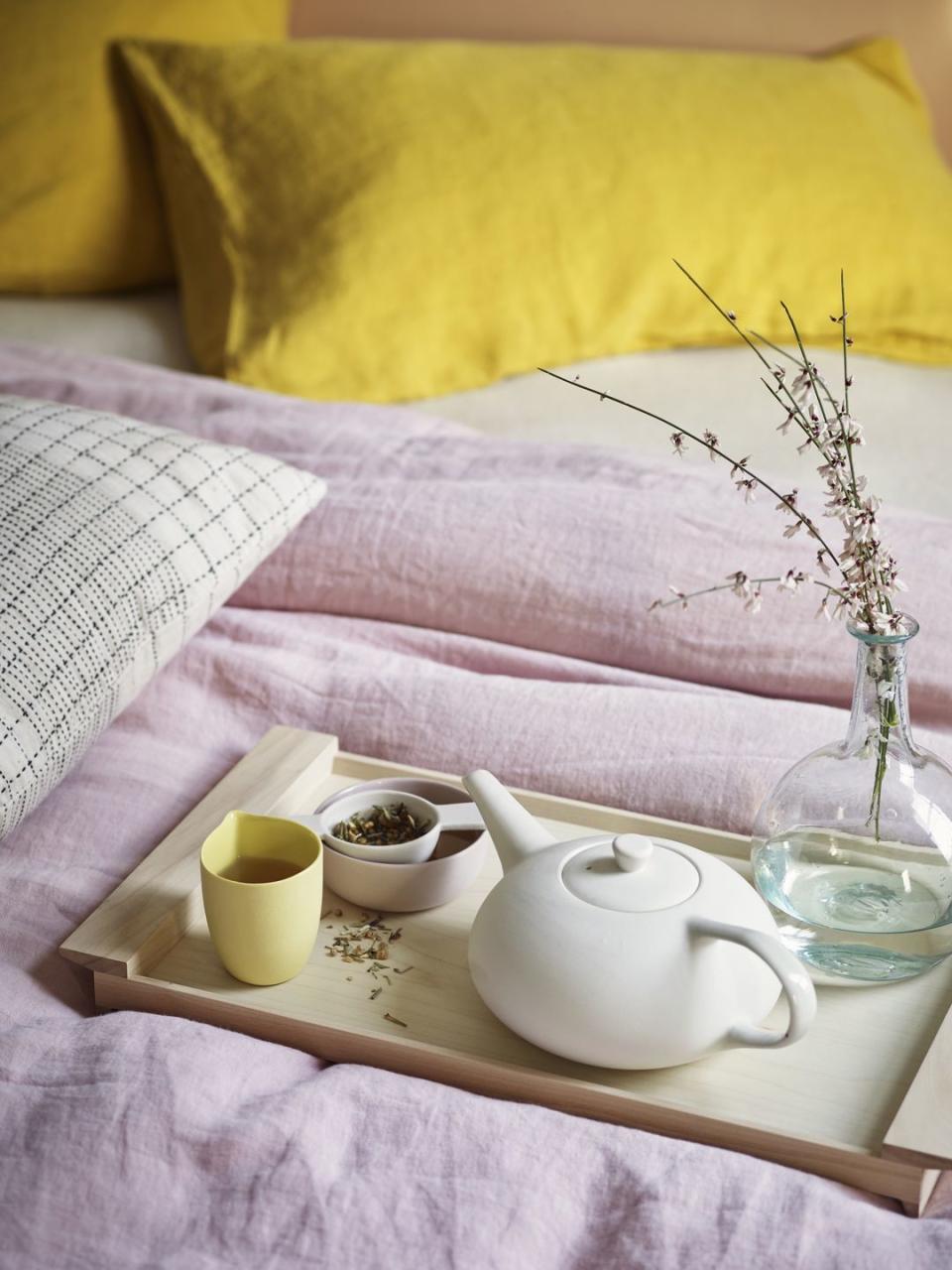
An uplifting blend
The scent of lemon, the refreshing taste of your favourite tea, the pleasing-to-the-touch artisan crockery and this beautiful blue – it all adds up to a brilliant way to stimulate the senses and get the day off to a lively start.
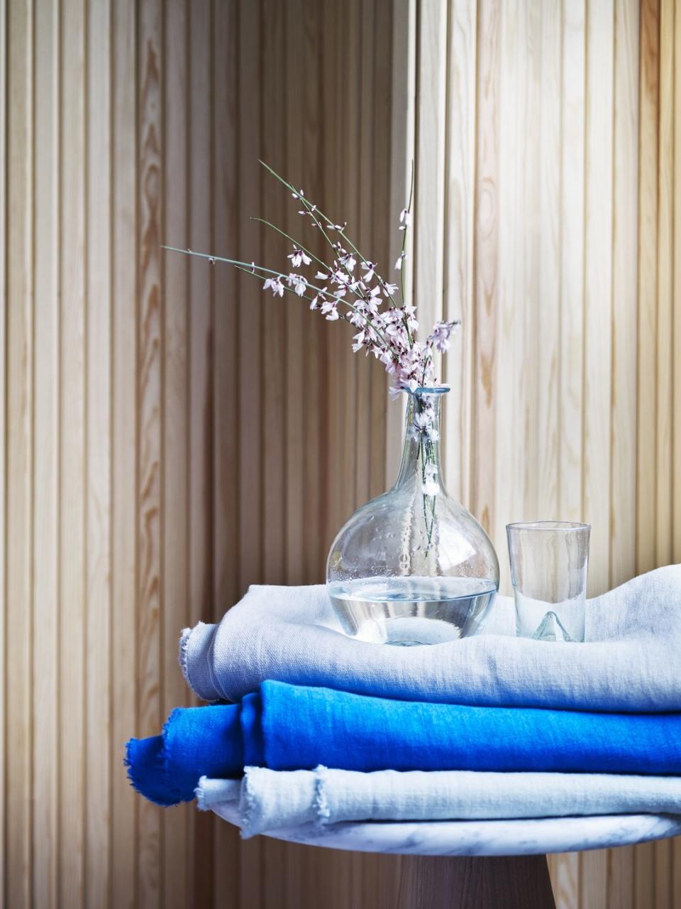
Sea of calm
Blues are the most accommodating of colours when it comes to working together. Mix and match for a serene palette – or create an ombre effect by layering shades from dark to light. Keep pattern minimal to make it look modern and impactful and team with simple accessories to let the colour have its moment.
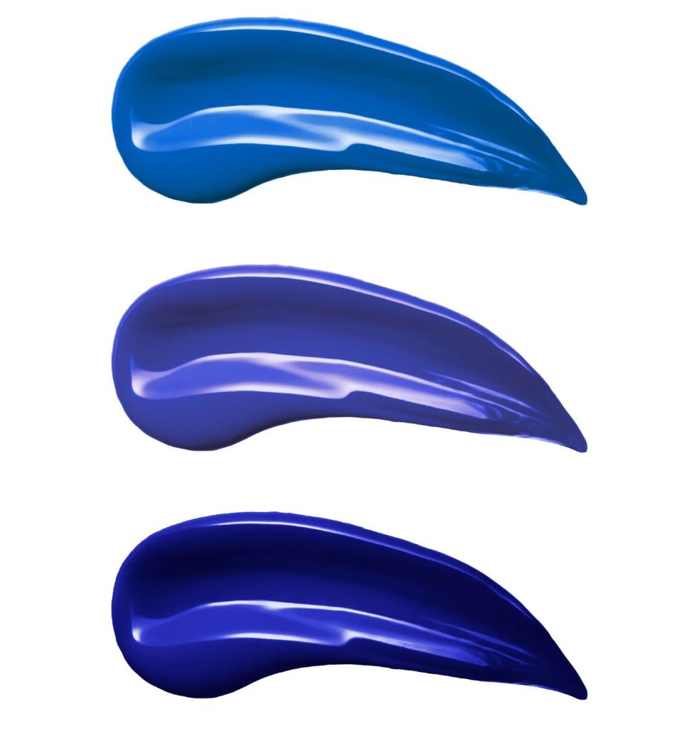
Perfect blues
1. Santorini 71 paint, Fenwick & Tilbrook
2. Napoleonic Blue wall paint, Annie Sloan
3. Thai Sapphire absolute matt emulsion, Little Greene
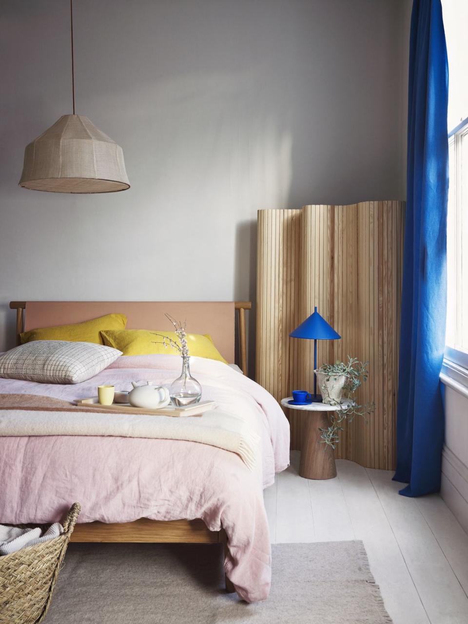
PINKS
Awash with pink
Now considered a neutral, pink and all its blush-like varieties is wonderfully versatile – performing brilliantly both as a canvas on which to layer other colours or as the main event itself, as seen on this daybed. The key is finding the right shade – for walls, opt for a soft, chalky tone that will allow whites and bright pops to sing, or choose something airier for a focal point.
A blossom hit
Nothing says spring quite like seasonal blooms, so celebrate the season and enjoy its colour and scent by placing branches in tall vases and jugs, and put them in the centre of a display for a dramatic yet delightful effect.
Tell it through textiles
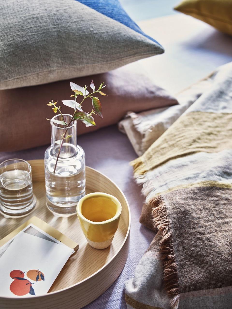
If you don’t want to go for a full-on rosy theme, get a hint of a tint through throws and cushions instead. Soft pink looks particularly beautiful in tactile fabrics such as linens and teams happily with other natural shades for a laidback but stylish finish.
Perfect pink shades
1. Middleton Pink No. 245 estate emulsion, Farrow & Ball
2. Kate Blush matt emulsion, Claybrook
3. GoodHome Naturéa Rosa Velvet matt wall paint, B&Q

YELLOWS
Sunny yellow touches
The ultimate feelgood hue, this joyous colour instantly lifts the spirits. Add freshness with breezy lemony shades or, for a bedroom, opt for something warmer such as an earthy ochre. A set of saffron pillowcases is all you need for a blissful finish, and they’ll look gorgeous paired with soft pinks.
Lemon sorbet
If you resonate with more subtle shades, pale yellow is a delicate option that partners beautifully with soft neutrals and pinks, as well as deeper mustards, for a delicious colour combination.
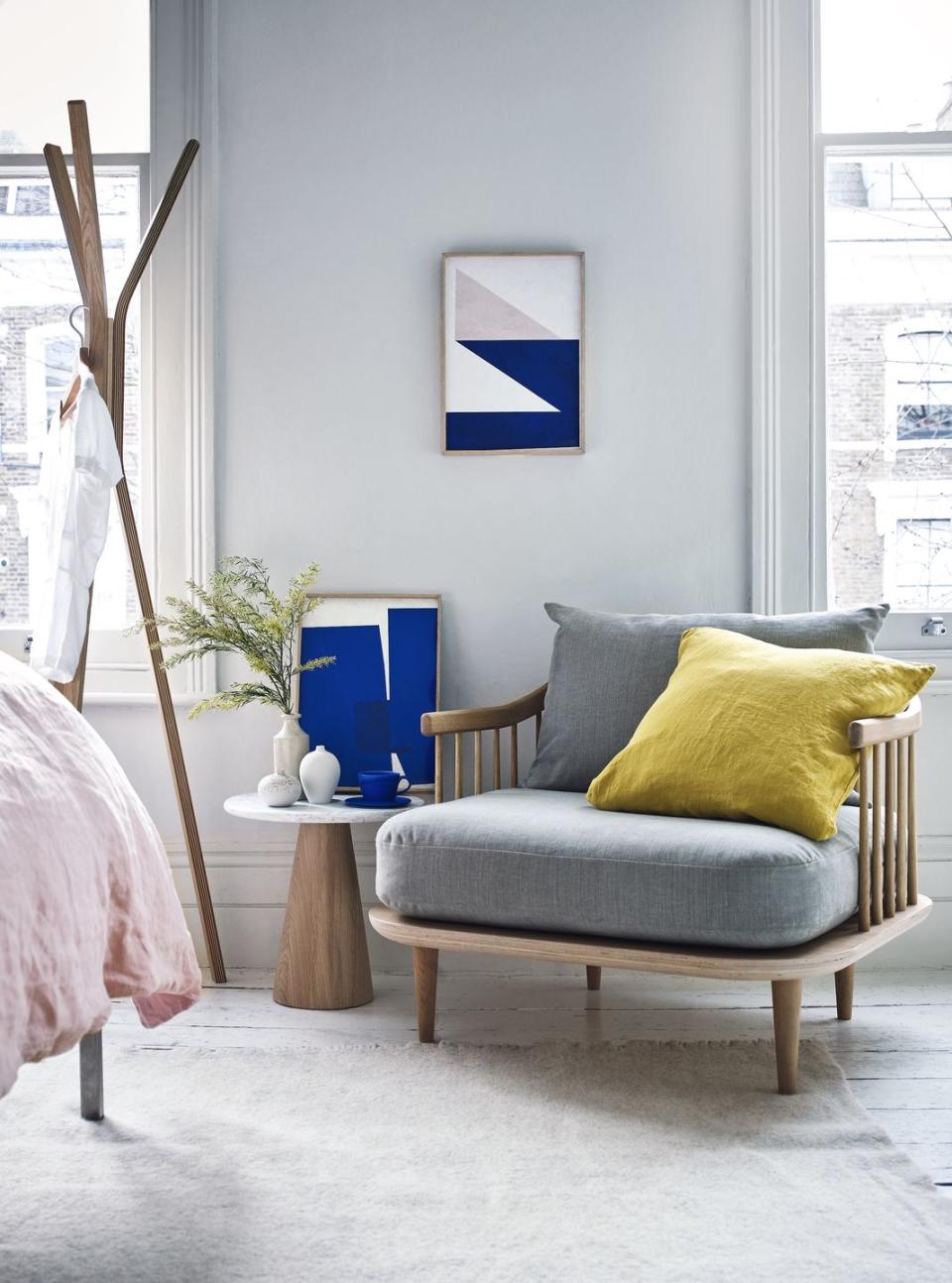
Easy peasy
Arguably the simplest way to update any space is to add a colourful accessory or two. Here, just one yellow cushion brings an elegant scheme of blues, greys and soft pinks to life, effortlessly elevating the whole look.
Perfect yellow shades
1. 1829 Chalky emulsion paint in Jasper Yellow,
2. Happy Daze matt emulsion, Crown
3. Mudgley Mustard wood paint, Thorndown
You Might Also Like

