

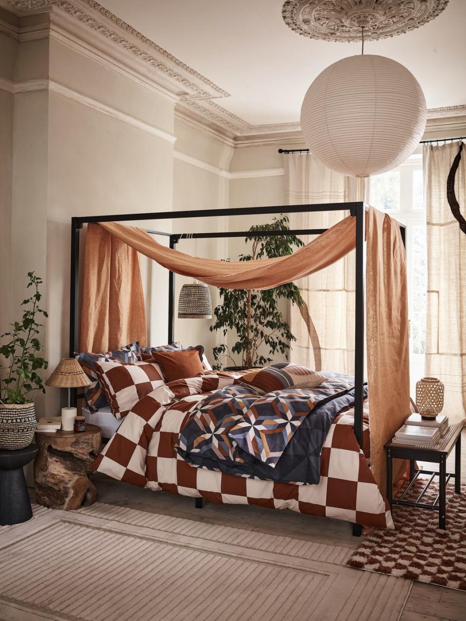
28 colour combinations that just work (and some may surprise you)
We are all for plain white walls, simple neutrals, and slick monochromes in the home – they are versatile, easy to get right, and there are a myriad of tones and shades to play with. But when it comes to choosing colour combinations, striking the correct balance of warm and cool, bright and moody, and bold and soft can be tricky.
A colour wheel can help you develop harmonious colour schemes for your home using a number of key approaches. Colours that sit side by side on the colour wheel, or 'analogous' colours, tend to be harmonious and pleasing to the eye, while colours found on opposite sides of the colour wheel, or 'complementary' colours, have a high contrast between them that creates a bright and vibrant colour scheme.
One of the joys of picking a new colour palette for your home is discovering new and surprising combinations that just work, like a luxurious gold ochre and a rich brown, a deep burgundy paired with chalky lilac, or graphite grey with a bright green. It can also throw up some dated interior design rules (like never mixing orange and pink) that were absolutely made to be broken.
Read on for 28 colour scheme ideas you should try in your home, and some that may surprise you...
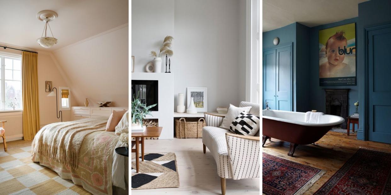
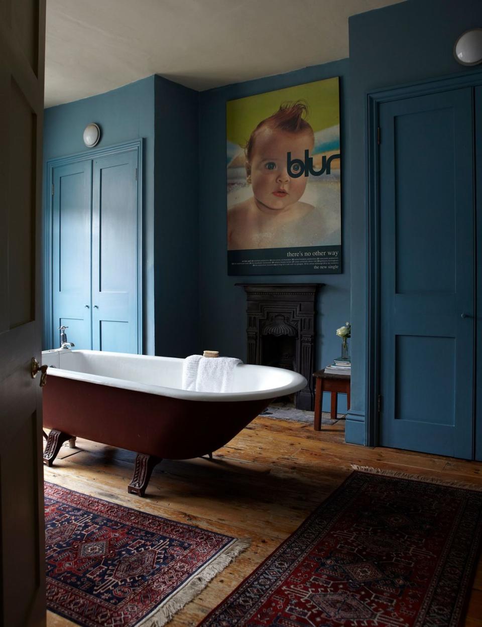
Blue and burgundy
A jewel-toned blue and deep burgundy colour combination brings a richness and sense of luxury to a room. The splash of chartreuse in the form of a modern graphic poster prevents this scheme from looking too heavy.
Pictured: Stone Blue by Farrow & Ball
Yellow on yellow
Combining variations of the same colour can be really impactful. You can choose three or four colours from within the same family, but it is most effective if you have at least one strong contrast – like the two-toned staircase here with a warm ochre above and pale lemon below.
Pictured: Stairs painted in Wharf Sacking, back wall painted in Sella, both at Mylands
Read more: 16 hallway colour ideas to create the best first impression

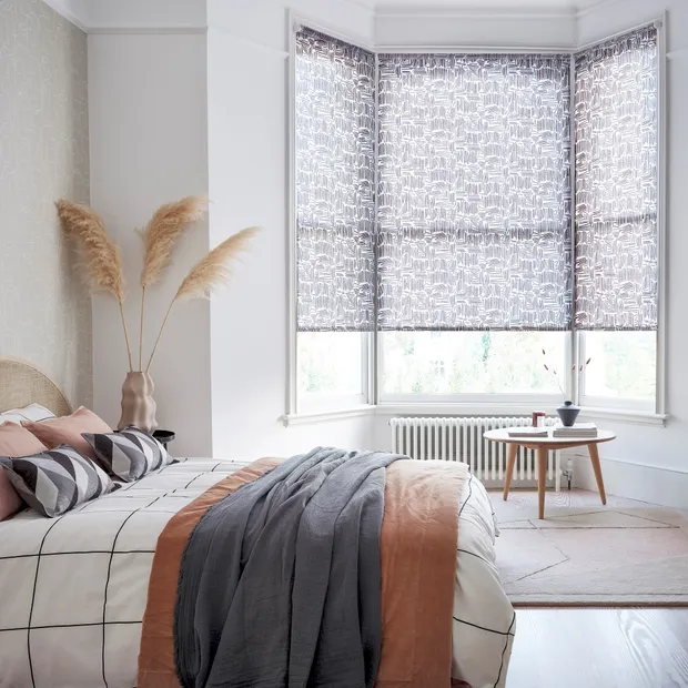
Grey and terracotta
This is a really lovely example of using the right grey. These warming terracottas wouldn't sit so happily next to very cool colours, and so a warm grey with lovely lilac undertones is chosen instead. A buttery yellow would be a suitable accent colour here.
Pictured: House Beautiful Matchsticks Mono Blinds at Hillarys
Read more: 17 colours that go with grey, as revealed by stylists
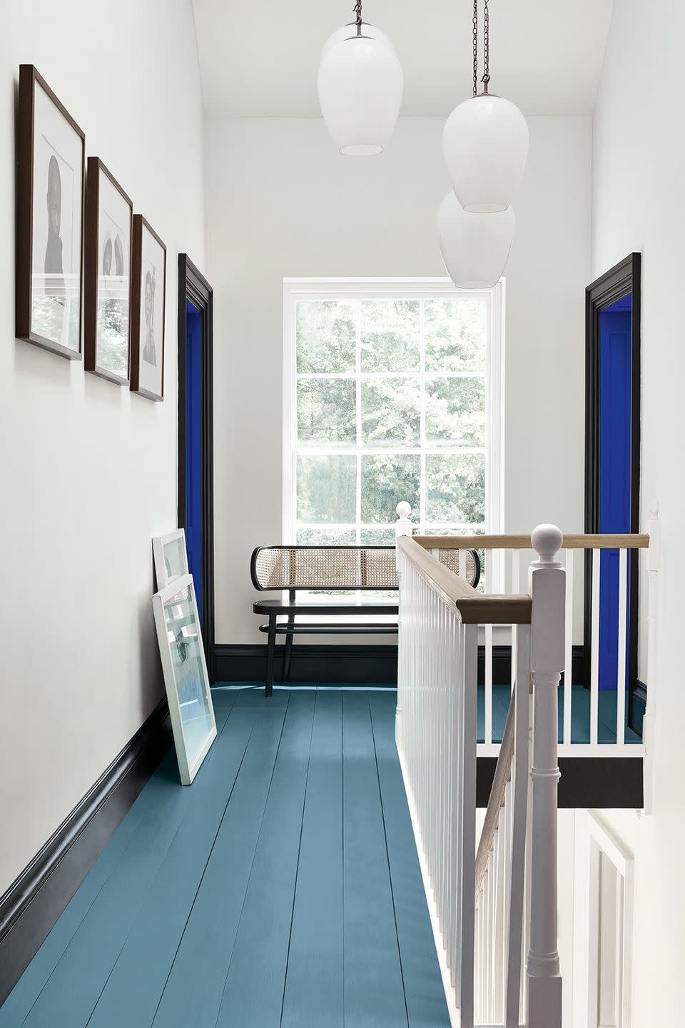
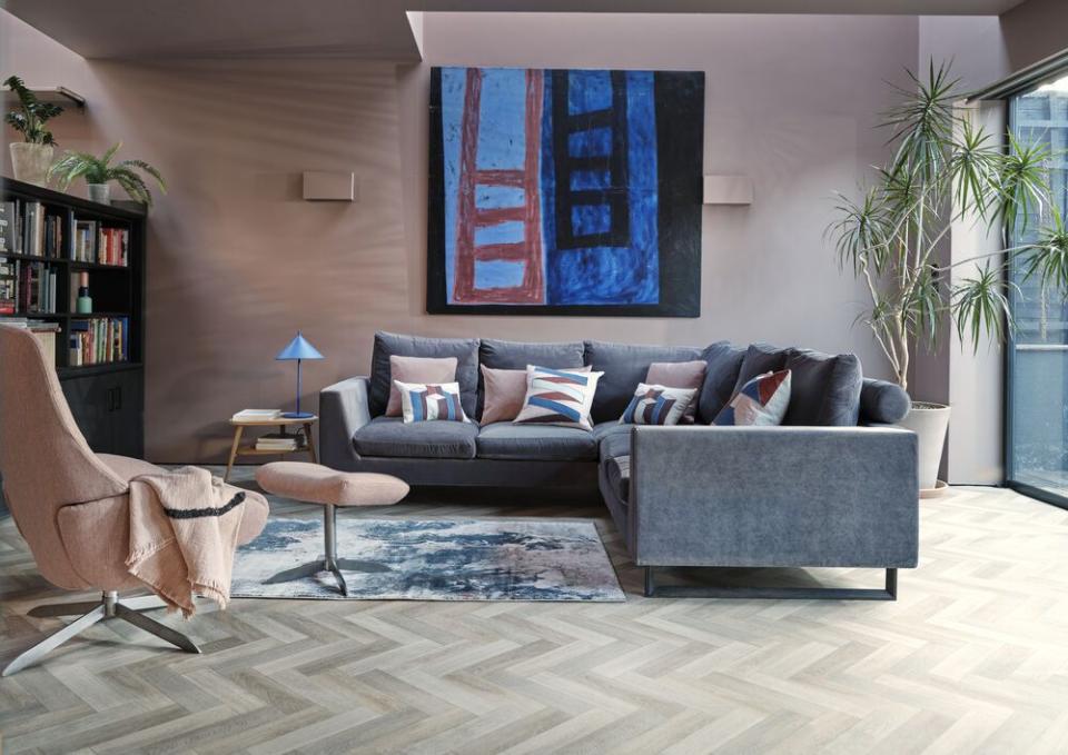
Black, white and blue
A room that is predominantly black and white really invites any number of colour combinations – this landing would have equal impact in a pink, lemon yellow or green, for instance. Using the black as a framing device is really clever, too.
Pictured: Walls painted in Shallows, floor painted in Air Force Blue, both at Little Greene
Grey and beige
Greige – a combination of grey and beige – marries the cooling and more placid look of true grey with the warming nature of beige. It's a near foolproof combination for a serene bedroom. We love the subtle undertones of pink here that work so well in south or west-facing rooms with lots of warm natural light.
Pictured: House Beautiful Grove Ottoman Bed at Dreams
Read more: 13 ways with greige - how to master the grey/beige neutral
Sage and dusky pink
This is a perfectly calming colour scheme for a home office or bedroom. Soft sage green promotes tranquility and introduces a sense of nature, while dusky pink is a subdued feminine shade. A third match would be blue, used here as a striking pop of colour to draw the eye.
Pictured: Treron and Sulking Room Pink, both by Farrow & Ball

Grey and multicolour
Grey can disappear like a neutral when put next to multicoloured accessories and patterns, so treat it as you would a white canvas. Your colours will stand out beautifully against a darker slate like this one.
Pictured: House Beautiful Westbourne Kitchen at Homebase
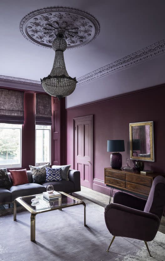
Burgundy and lilac
One for bold colour lovers. Burgundy is a rich shade with dramatic impact when used in great swathes. A soft lilac is not the obvious match, but it brings out the purplish tones in the burgundy and plays down the red. A third match in this instance would be a graphite grey, or touches of subtle green in the form of plants.
Pictured: Grenache and Lady Char's Lilac both by Paint & Paper Library
Red and orange
This fabulous bedroom is a great example of using analogous colours – those that sit side by side on the colour wheel and tend to produce harmonious design schemes. The lovely deep red and tangerine combination sits on a whisper-soft neutral base which really lets them sing.
Pictured: Cushions, side table and duvet set, all George Home
Read more: 8 bedroom colour ideas to inspire a makeover
Emerald green and soft blue
Emerald greens are frequently matched with clean whites, light pinks or ochres, but green and blue are neighbours on the colour wheel, making them perfect partners. Green and blue are both cool colours, which can make them refreshing, but make sure to pick similar shades – an apple green with a vivid cerulean for instance – or as we see here, two soft and earthy tones.
Pictured: House Beautiful Darcy Sofa at DFS
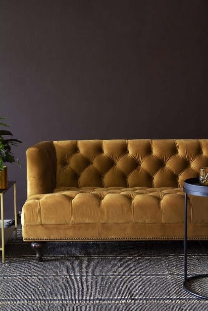
Ochre and rich brown
Brown may not be the obvious choice for your walls, but it does a perfect job of bringing out the richness and warmth in this fabulous gold ochre. In a darker room without much natural light, cream-coloured walls, and a natural wood flooring underfoot would achieve the same effect.
Pictured: Ochre Velvet Chesterfield Sofa at Rockett St George
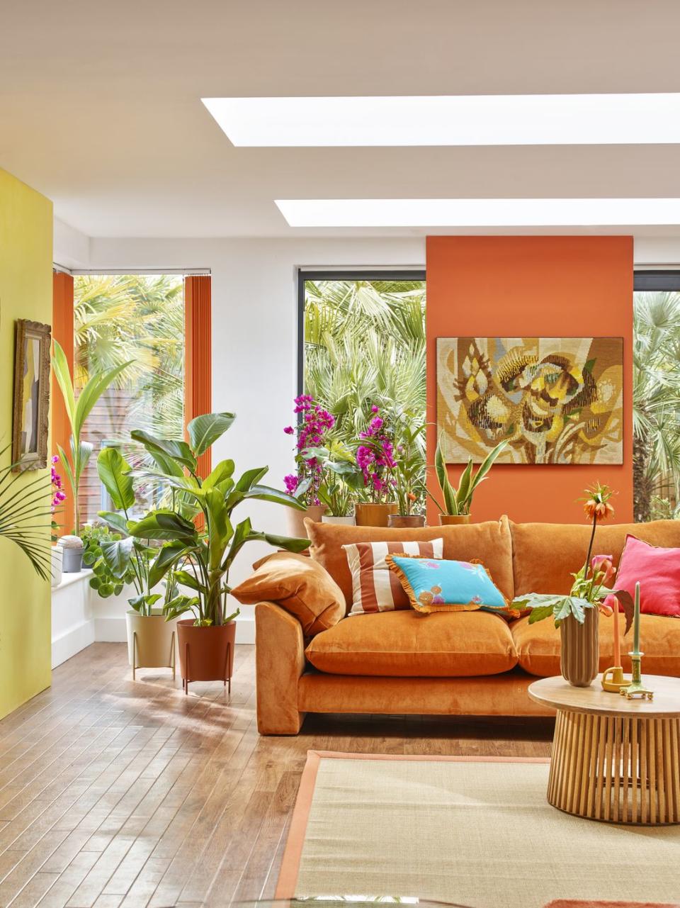
Tropical orange and yellow
This is one for those who feel invigorated by colour. This tropical living room combines bright and citrusy shades to create a holiday at home feeling – and of course the abundance of greenery only serves to enhance the effect. The pop of electric blue is so welcome against a canvas of warm shades.
Read more: 17 living room colour ideas
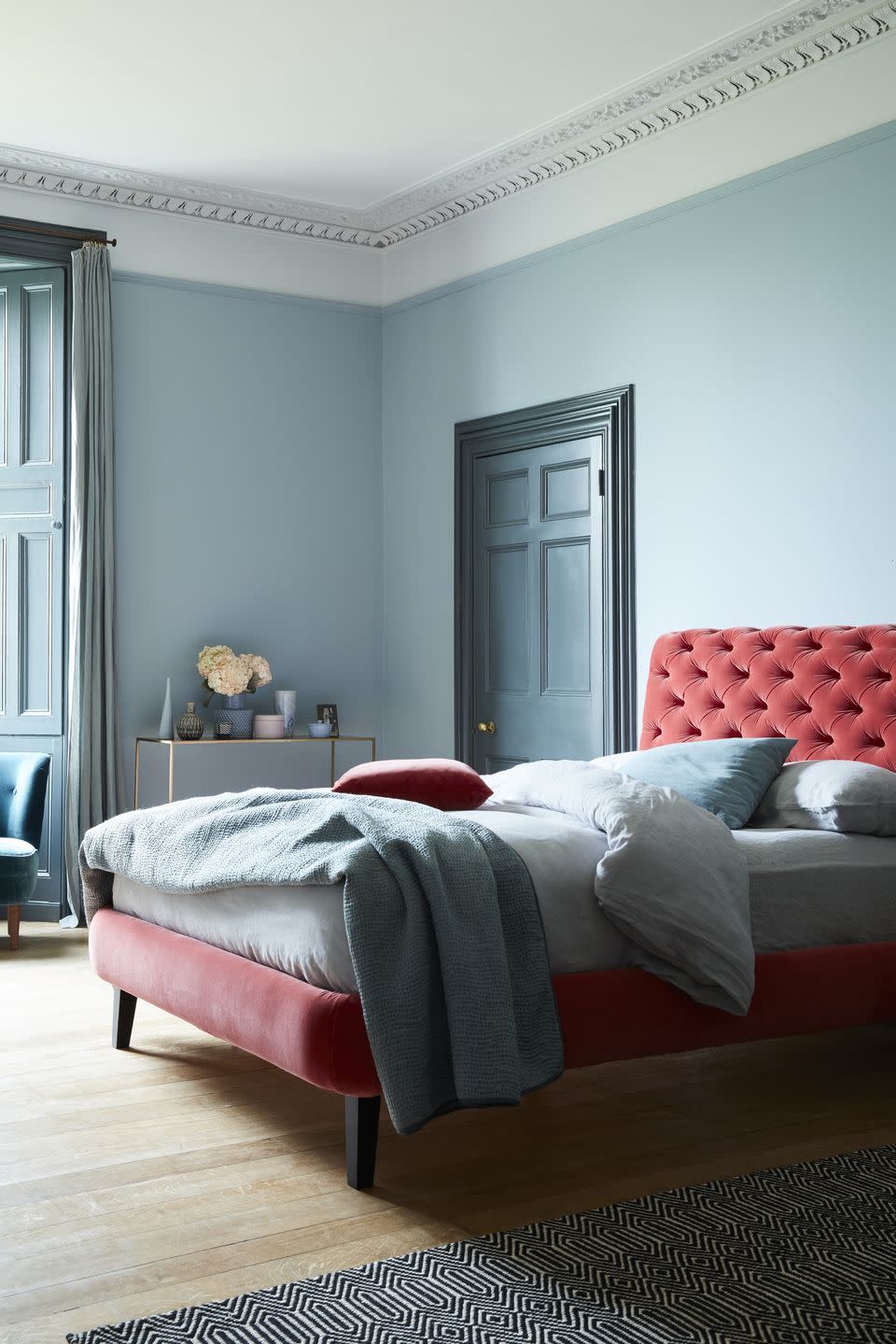
Pale blue and rose
These are perfectly complementary colours according to the colour wheel. Use a calming blue as your dominant colour – especially in a space like your bedroom or home office – and add a dusty rose as your accent. A third match here would be splashes of buttercup yellow.
Pictured: Knightsbridge Double Bed In Dusty Rose Velvet at Sofa.com
Read more: 21 blue bedroom ideas to fall in love with
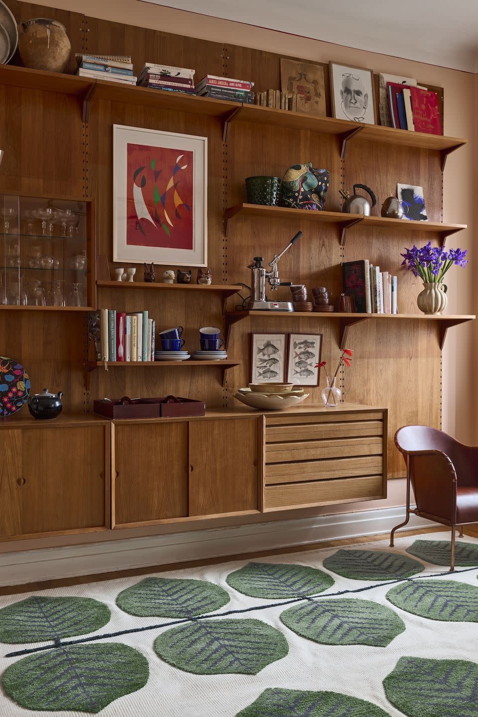
Green and wood
This colour scheme is very retro and seventies inspired, with a warm reddish wood alongside some jewel tones in the jade green rug, ruby red artwork and the flashes of purple and blue across the shelves. It is a really elegant way to create a dark feature wall that doesn't look imposing.
Pictured: Stig Lindberg Bersa Rug at Layered
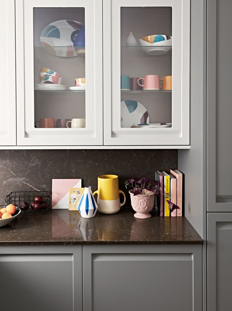
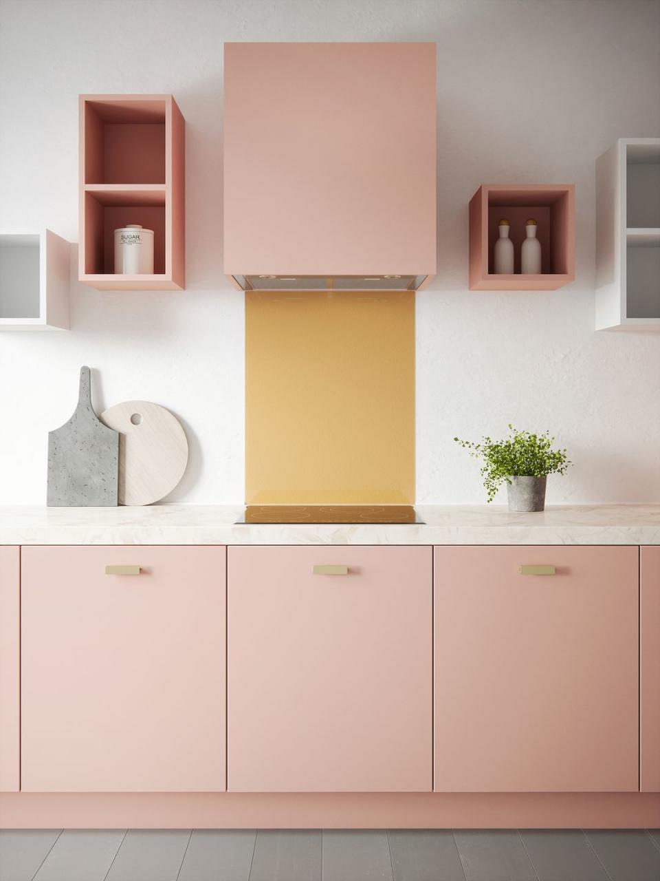
Pink and gold
Pink and gold may only sound appropriate for a teenage bedroom, but softer shades are key to making the pairing feel a bit more grown up. A champagne yellow or metallics like gold and brass, mixed with a pale pink, creates a sophisticated colour scheme. We love that it's used in a kitchen here to enliven an otherwise functional space.
Pictured: House Beautiful Champagne Splashback at Splashback
Read more: 18 kitchen splashback ideas
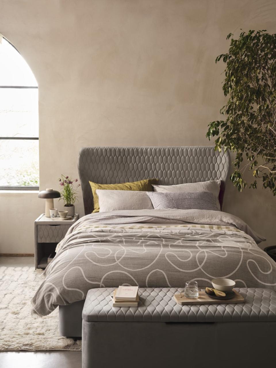
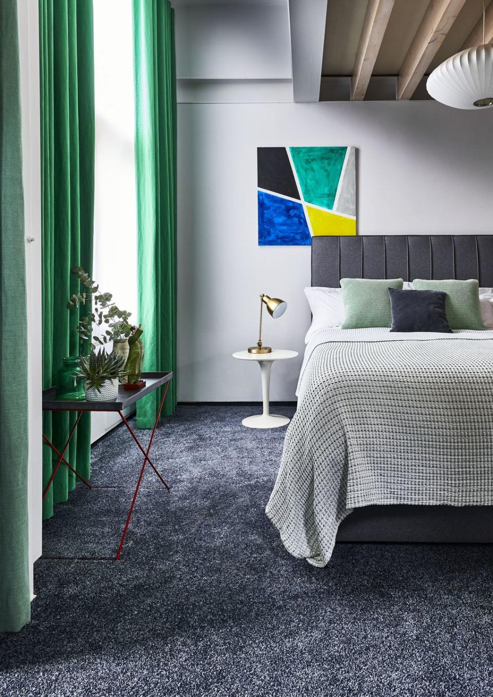
Graphite grey and bright green
Grey is a bit of a gift when it comes to colour schemes because it goes with just about anything. A rich, graphite grey tends to make bright colours even more vivid. It is a useful tool to wake up a room by highlighting bold features – like these dramatic green curtains.
Pictured: House Beautiful Super Sublime Carpet at Carpetright
Read more: 26 grey bedroom ideas
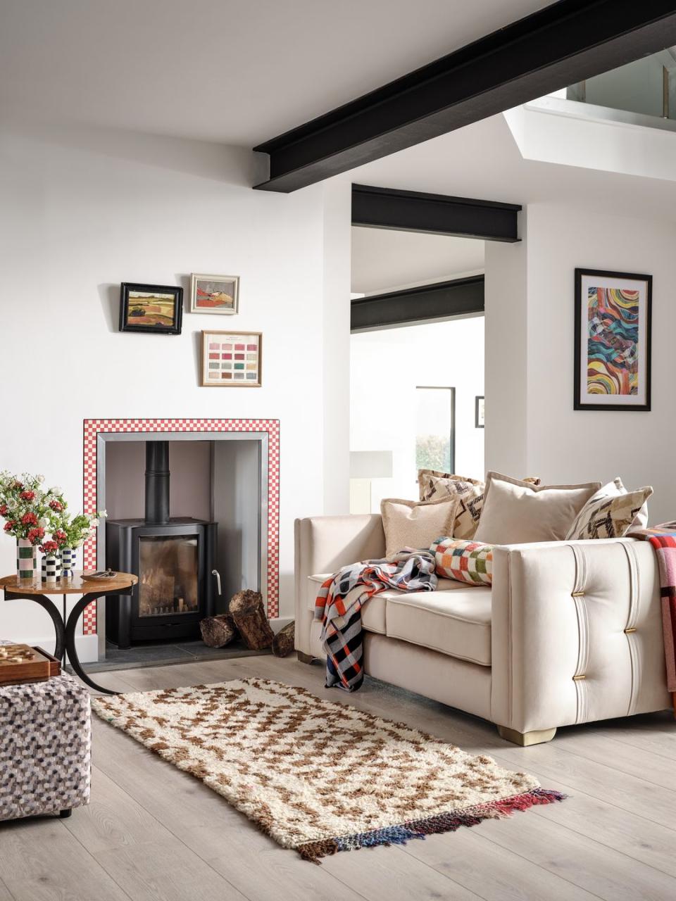
Cream and multicolour
If you like the idea of using intense pockets of colour – similar to the colourful rug, throw and fireplace surround shown here – then cream is the perfect base. An equally colourful wall or sofa in this living room would be overpowering, but a neutral is always a safe choice.
Pictured: Titan 2 Seater Pillow Back Sofa and Footstool, both at Sofology
Soft pink and midnight blue
Soft pink and a strong midnight blue create a vintage feel, especially when used in homes with period features. While a lighter blue would make this scheme fairly saccharine, suitable for a modern kitchen or bedroom, the inky tones of a dark blue create a more sophisticated look.
Pictured: Pink Ground and Hague Blue, both by Farrow & Ball
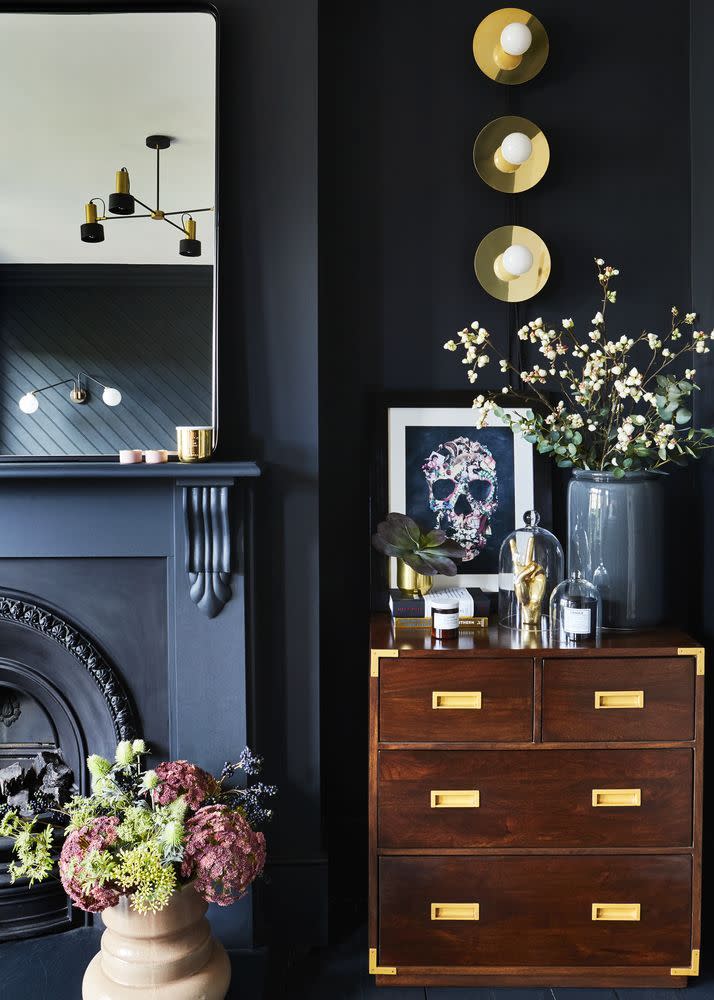
Black on black
A dark on dark colour palette can be a daunting choice in the home, but it works particularly well if you have lots of interesting architectural details in the home like fireplaces, wall panelling or cornicing. They will add a bit of depth and some lovely highlights and shadows – a clever design device that prevents dark colours from looking flat.
Read more: How to use black accents in every room in your home
Buttercup yellow and rose pink
You might assume that a pale yellow and pink combination is only appropriate in a child's room or that it lacks sophistication, but as you can see here, neither are true. There are a couple of important elements to note if you're replicating this design scheme at home – namely the accents of black that offset the pastels, and the mix of elegant pieces like the floor lamp, layered bed and cane occasional chair.
Pictured: Chess Wool Rug in Harvest Yellow at Layered

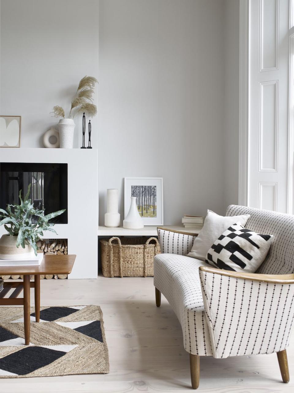
White on white
White is a gift when it comes to creating colour combinations as it will sit happily with just about anything, but forgoing colour for a white on white design scheme can look really calm, clean and pristine. Remember that white is very responsive to natural and artificial light, so when decorating with white, work with your room rather than against it.
Pictured: Dulux Heritage Romney Wool
Read more: The best paint colours for north, east, south and west-facing rooms
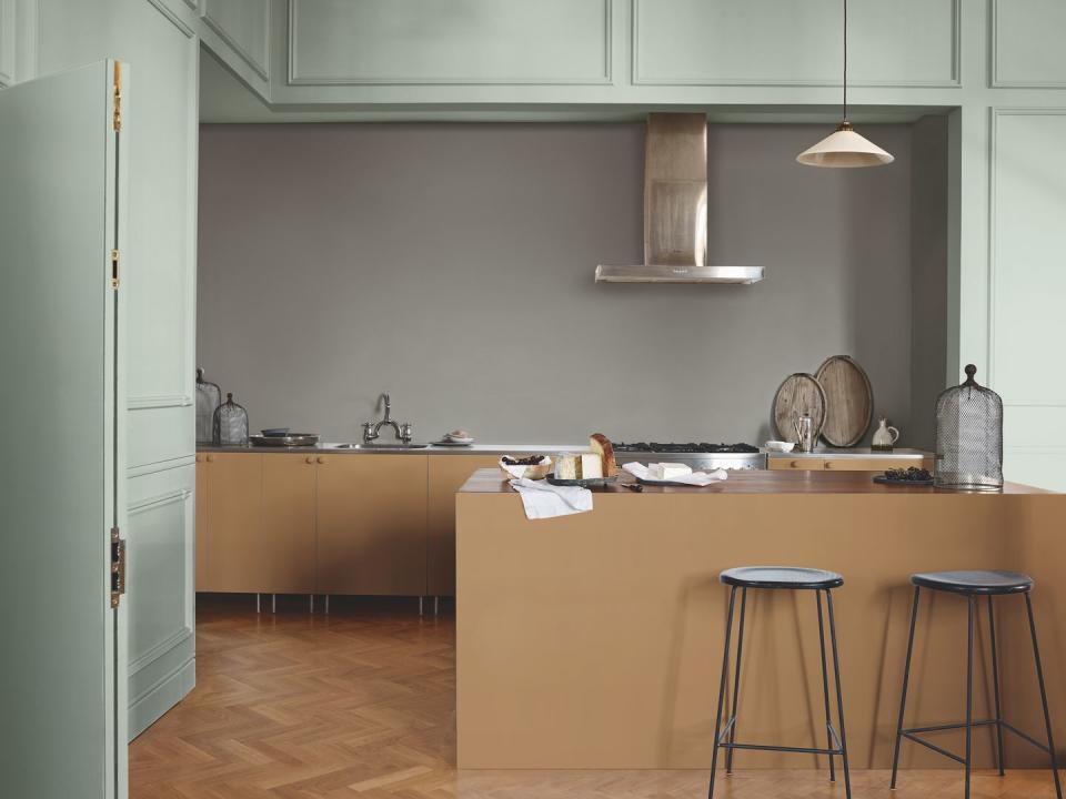
Mint green and mustard yellow
This serene kitchen demonstrates how calming a pale green and soft yellow/orange colour combination can be. As the experts at Dulux tell us: 'Muted yellows like buttercup, vanilla, saffron or sand could help brighten a space with limited natural light or make a space with high ceilings feel cosier (choose a shade that leans towards orange, rather than green, to enhance this colour trick).'
Pictured: Tranquil Dawn and Spiced Honey, both by Dulux
Citrus and blue
The combination of citrus colours (the orange, peach and yellow shown here) and blue is the perfect example of the complementary pairing dictated by the colour wheel. These are found on opposite sides of a colour wheel, with the characteristic high contrast that creates a bright and vibrant colour scheme.
Pictured: Marvella 2.5 Seater Sofa at Sofology
Grey and pastels
This living room is a great example of using pastel colours to soften the severity of dark grey. 'You’d be right to think graphic shapes and gunmetal grey is a typically masculine look, so add curves with blush pink and plaster pink on the walls to soften the look and keep it the right side of pretty,' says House Beautiful's style and interiors director, Sarah Keady.
Pictured: House Beautiful Luna Moonlight Rug at Carpetright
Saffron red and khaki green
Red and green are complementary colours according to the colour wheel, and usually make for a dramatic pairing – especially in moodier tones shown here. When used at home, match with earthy, neutral colours and natural materials to create a balance, and use pure white as your accent.
Pictured: Beetlenut and Heath, both by Paint & Paper Library
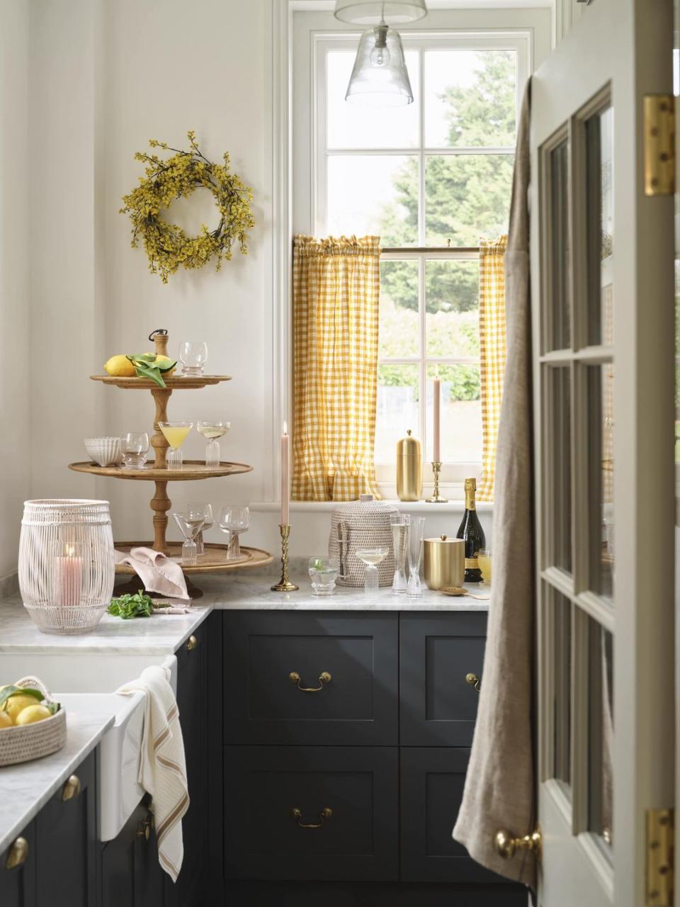
Black and yellow
The pairing of black and yellow may sound a bit cartoonish, but it makes for a really striking combination. It is particularly useful where you might have a lot of black – the kitchen cabinets here are a good example – where the yellow can add sunny, springtime connotations.
Pictured: All accessories from Layered Lounge
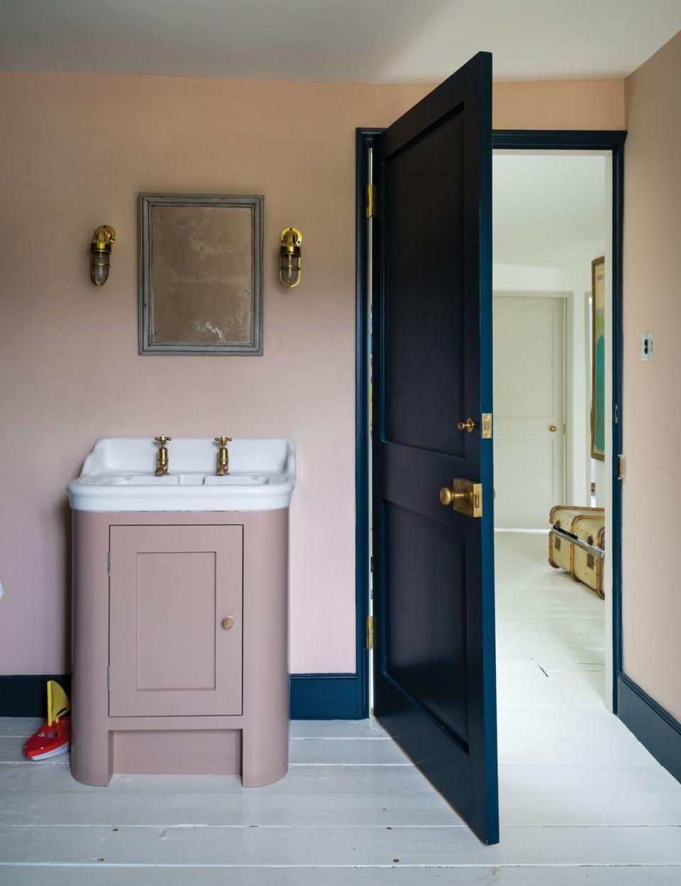
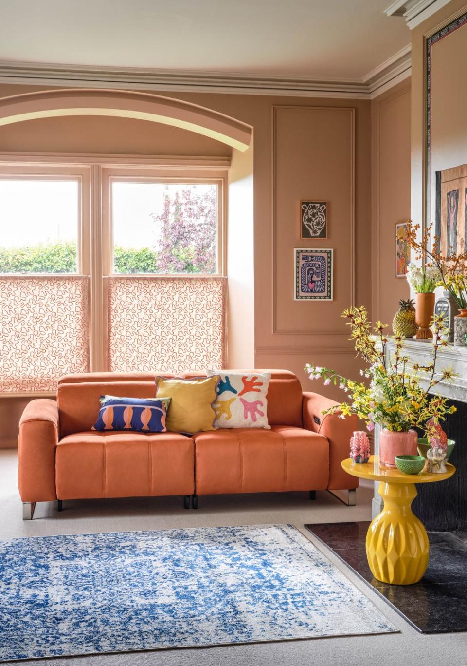
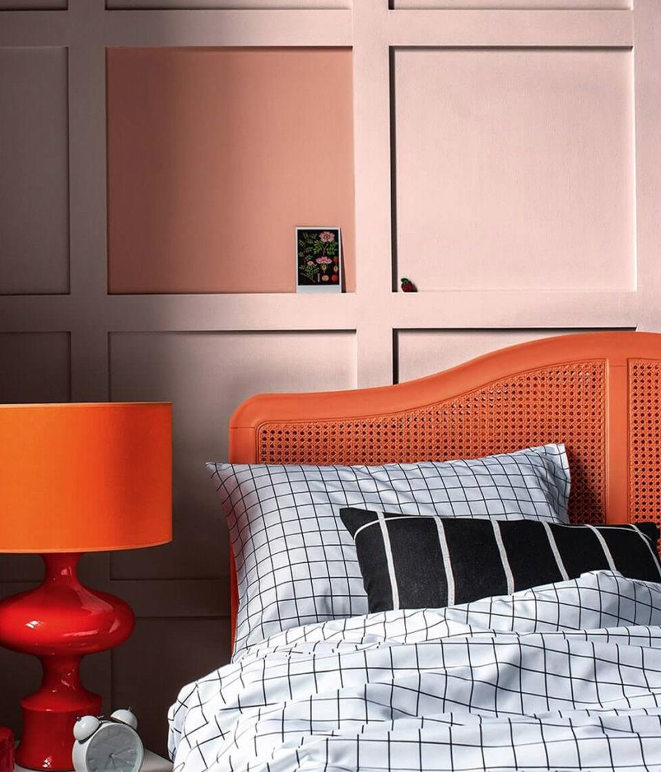
Pink and bright orange
Usually considered a clashing pair, pink and orange sit close to one another on the colour wheel, and so can work harmoniously when shades are chosen correctly. A vivid pink and bright orange combination can appear highly saturated and overwhelming, but softening your pink tones lets a fiery orange stand out.
Pictured: Copper Blush and Ballerina Dance, both by Dulux
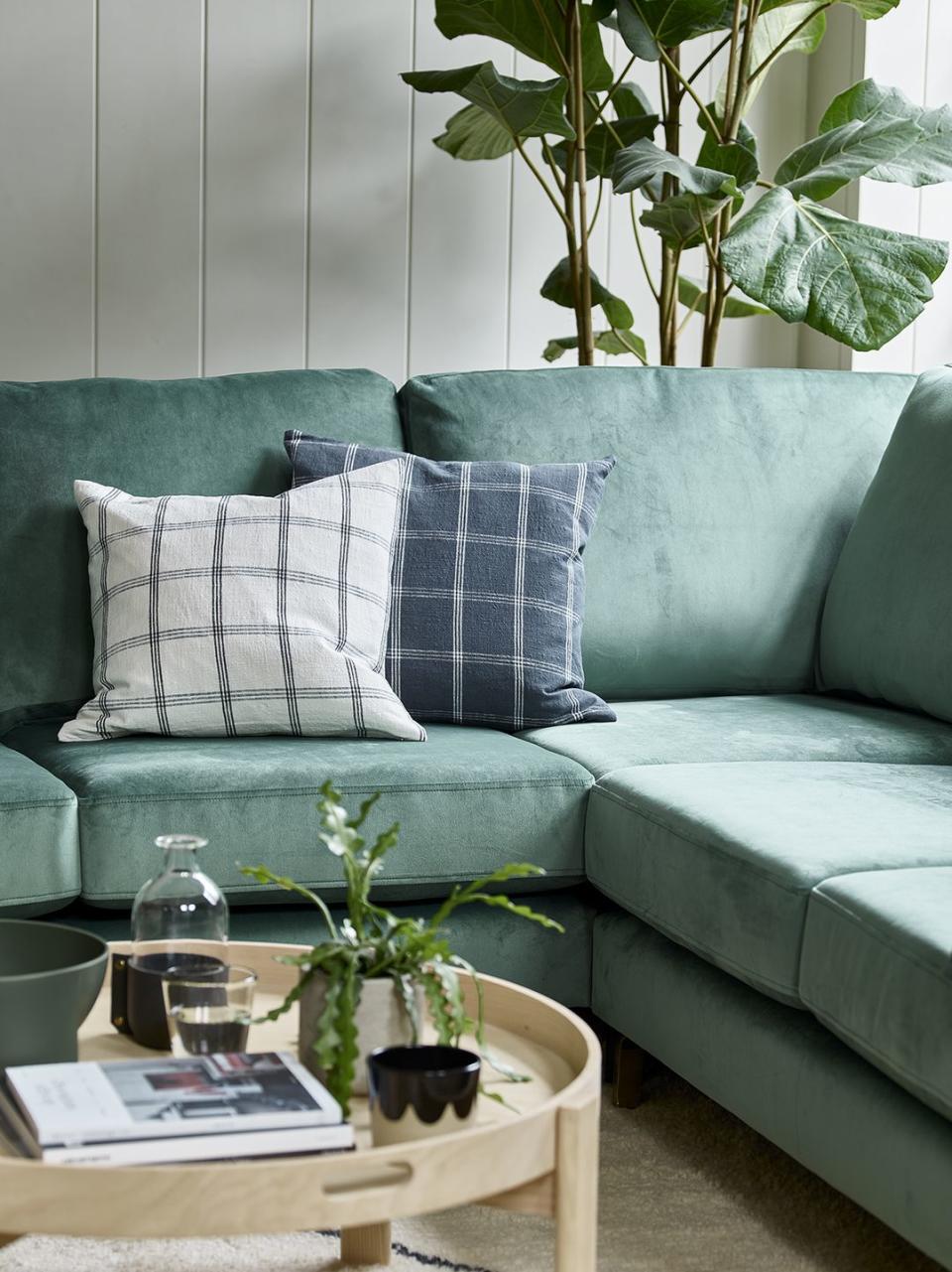
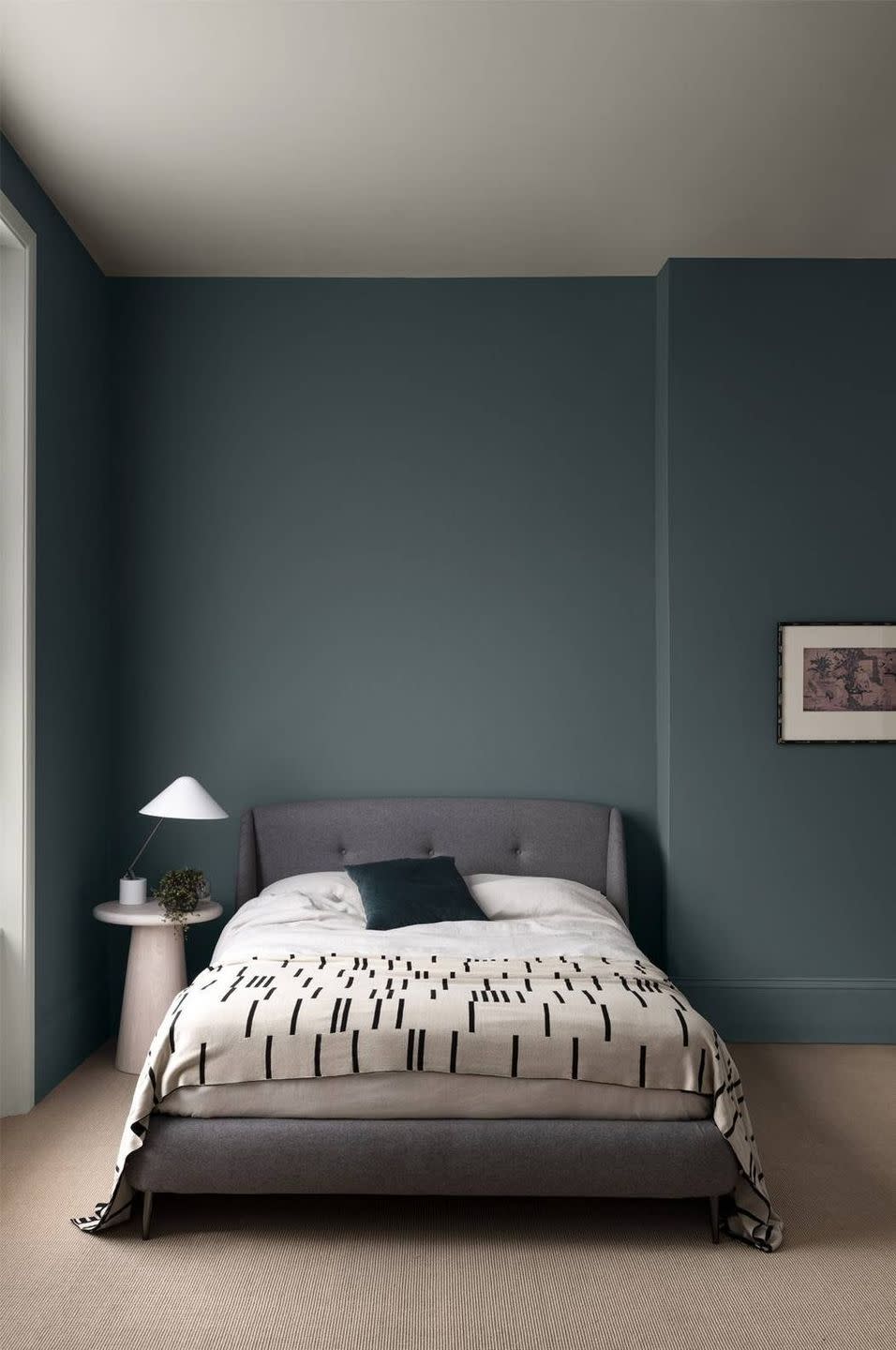
Blue/green and soft grey
A deep blue/green paired with a soft grey can create a serene and romantic feel. Velvet fabrics work well in this colour scheme to add to the element of luxury. Use swathes of lighter colours – creams and whites – on walls or floors to stop your green and grey colour scheme weighing down the feel of the room.
Pictured: Btwn Dog and Wolf by Paint & Paper Library
Follow House Beautiful on TikTok and Instagram.
You Might Also Like

