
5 houses that show how vibrant colours can be incorporated into your home
While some homeowners prefer to keep things plain and simple with a conservative monochromatic palette, others embrace their affinity for wild splashes of colour that somehow blend well in their residential units. Here, we highlight five vibrant homes in Singapore that illustrate how taking risks with colour can pay off beautifully. By Arman Shah
Mix and match
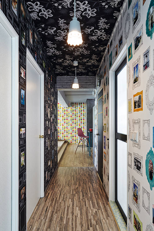
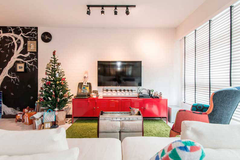
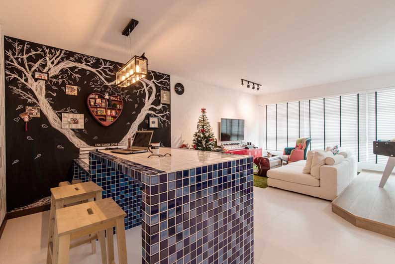
Designed by the folks at Mint and Pistachio, this stunning 5-room BTO flat reflects the unique personalities of their new homeowners. To ensure that a cohesive look was achieved, colours, patterns and textures were mixed and matched based on compatibility and creative instinct. The end result sees almost every surface area of the apartment covered with at least 14 types of prints on wallpaper, laminates, tiles and fabrics. See rest of the home here.
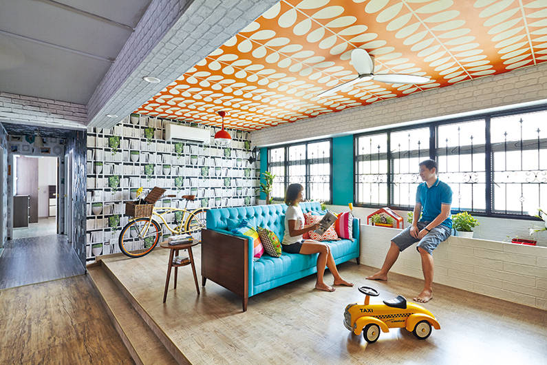
Colour demarcations
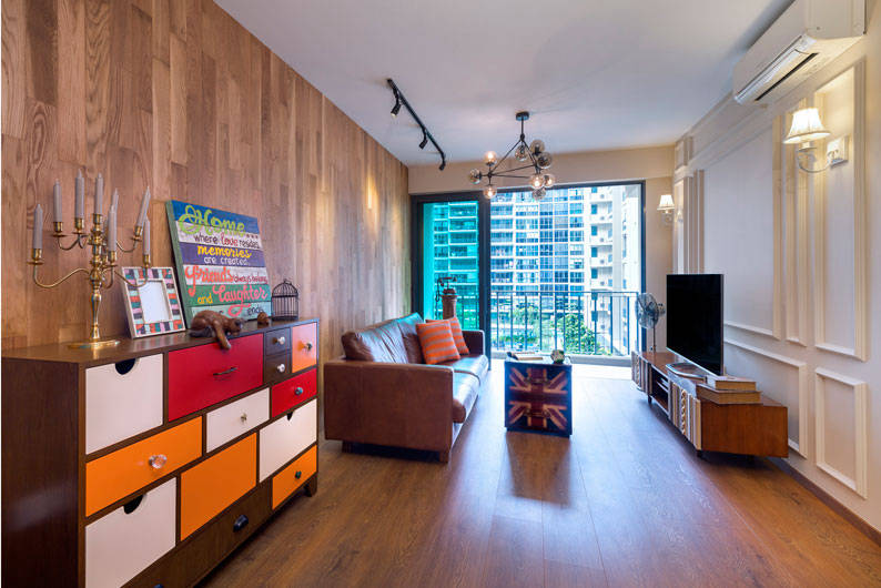
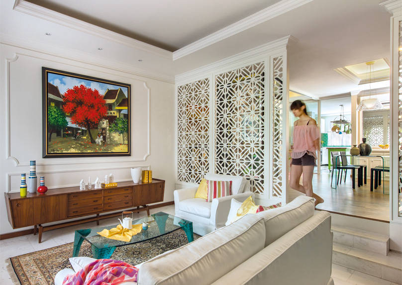
If safe is synonymous with predictable, then the interior of this executive condo at the Esparina is anything but. Thanks to the ingenuity of Third Avenue Studio, colour is used as a powerful design tool in demarcating the different areas of the unpartitioned living room. The colourful choices of furniture also contributes to the overall eclecticism of the house. See rest of the home here.
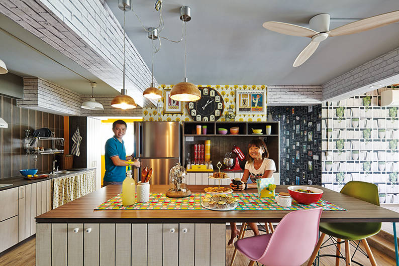
Youthful vibrance
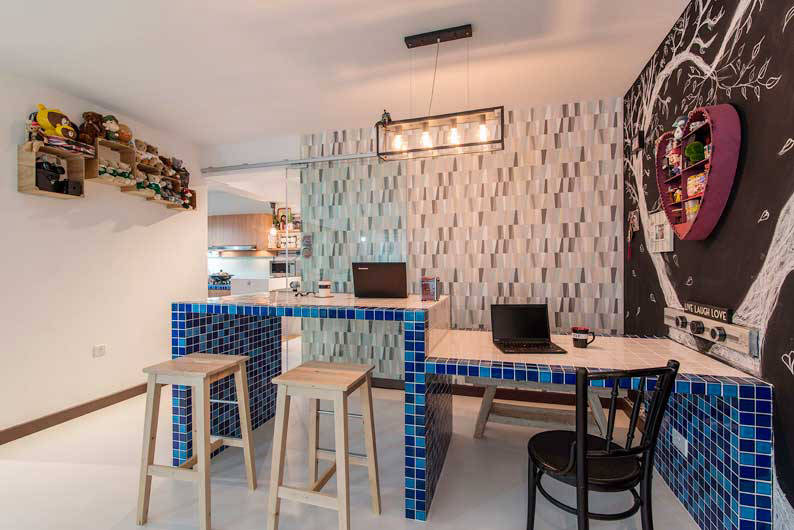
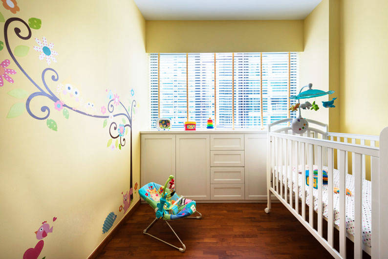
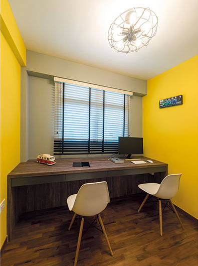
Nothing breathes life into a home quite like an explosion of colours. To help a pair of newlyweds with the renovation of their 4-room BTO flat at Fernvale Link, Atelier Concept went beyond the Scandinavian-inspired look and introduced lots of colours – zesty yellow walls for the gym room, blue mosaic tiles for the kitchen, and a delightful mish-mash of different coloured furniture and accessories for the living room. See rest of the home here.
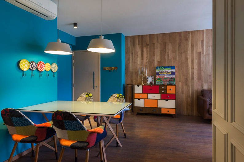
Pops of colour
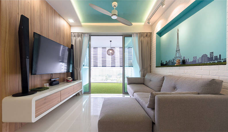
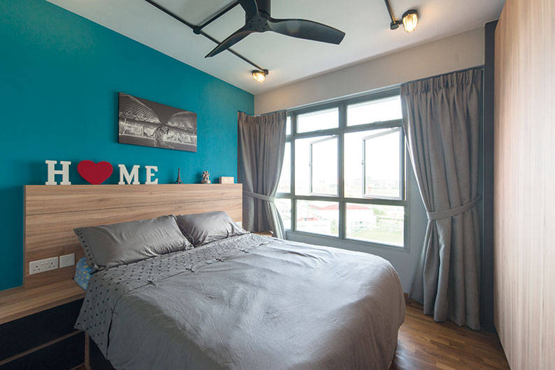
Incorporating colour into your home does not imply that you have to go overboard. To balance out the earthy tones and wooden textures of this Scandinavian-themed, 4-room DBSS flat, D’ Initial Concept introduced pops of colour that make a world of difference – a wall in the communal area was painted Tiffany blue, while another wall in the master bedroom was painted a deeper shade of cobalt blue. See rest of the home here.
Cultural symbolism
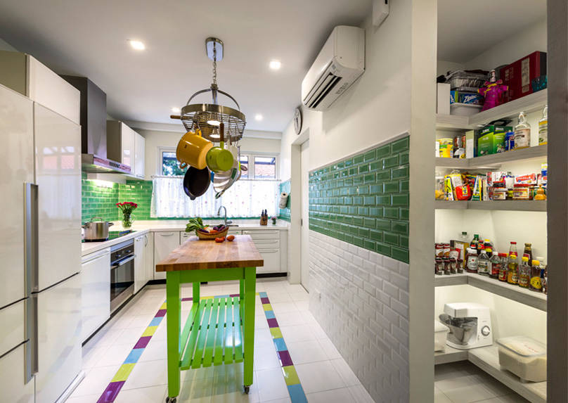
While it is tempting to showcase all of you through the design of your home, the end product might look like a spectacular mess. For this three-storey inter-terrace house that’s inhabited by a well-travelled family, Ciseern made the brilliant decision of representing their different global influences using different colours for different rooms. The kitchen is green and radiates a countryside cottage vibe, while the master bedroom is blue and boasts a Grecian sea theme. See rest of the home here.

